In pastels or any dry medium, the more colors you have, the easier it is to create the best effects. My ideal palette has all the primaries and secondaries in warm and cool versions with at least two tints and one shade of each, plus some muted colors, grays and earth browns also with tints and shades. Of course I don't always have my ideal palette at hand, especially if I want to sketch outdoors.
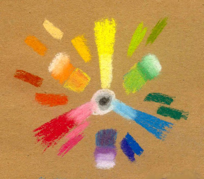
Above is a color wheel with every stick in my 24 Color Conte set laid out on medium brown Aquabee Bogus Recycled Rough Paper. White, gray and black form a bull's eye at the center. Yellow at the top, red at the left and blue to the right is a common primary triad layout.
If you didn't get this in grade school, the color wheel is the first thing most people learn about color. Primary colors are red, yellow and blue. They can't be created by mixing other colors. Secondary colors are orange, green and violet, which can be mixed by various proportions of spectrum primaries. Inevitably using children's art supplies, the red and blue produce a murky gray.
"It's the pigments" is what my kindergarten teacher told me as I scowled at that muck. "The red and the blue pigment aren't pure, they have a little yellow in them, so it turns gray." I was mad that the manufacturers had not included good spectrum primaries in the tempera line. Today's kid paints usually do, so I must not have been the only disgruntled kindergartener.
But the color wheel is much more useful than you'd think. Everything has a hue. A gray can be a blue-gray leaning toward green or toward violet, a brown might be closest to red, orange or yellow. Mix complementary colors (exact opposites on the color wheel) and you mute them. They become brownish or grayish but may still retain their identity. The color of my laptop case is actually a metallic deep dark orange.
When you make color wheels with any new art supplies, you begin to find out exactly what those mixtures can do and what you can do with them. You can also use color to create or control emphasis in any part of a painting later on when you've thoroughly experimented with your supplies - including a short palette of a dry medium. It's one thing doing color harmonies with 132 Prismacolors or more - recently they pushed that up to 150 and I know I need those other 18 pencils. It's much harder when you only have 24 sticks and really want three tints and a shade of every spectrum hue including tertiaries like red-violet or yellow-green and a good range of muted colors with their tints and shades.
I mixed my primaries by overlaying them. Red and the spectrum blue mixed evenly. Yellow and Red or Yellow and Blue took double doses of yellow, one under and one over, to get a secondary hue between the primaries. That's the kind of thing I test out with a new dry medium when I create these charts and color wheels. I blended with my sticks but you can do optical mixing by crosshatching or dotting, or finger smudge to get a smooth blend. It's your color wheel, do it your way.
I also wanted to place every stick that isn't a pure spectrum hue where it belongs on the circle. I put tints going inward by just going over the colors with the white stick, since a small set of color Conte doesn't have light yellow, light pink, light blue or even a couple of versions. It takes practice mixing the hue and value you want, although these hard pastels are particularly good mixers.
Then I put the secondary hues next to their mixed versions and tinted those up too going toward the outside. Very useful information if I'm sketching on the spot. I'd rather find out in a diagram like this that I need to use very little violet and a lot of white to get lavender, or that the purple stick is more red-purple than pure purple.
One thing that can be very useful is to look at the colors you have and see what combinations suggest themselves. My Conte set naturally includes Sanguine, a dark orangy red, and an earth orange that's more muted than the orange stick. The blue is very bright, but using white to lighten it and shades the sky also mutes it a little. If I want to sketch autumn foliage, I'll get a richer effect using the sanguine, earth orange and peach stick than I would using the bright orange stick. The complementary background would possibly make a bright orange tree too garish.
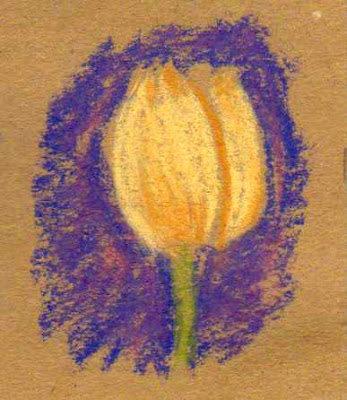
Here's how it looks in combination:

But if I want to make a more muted color look bright, using a fully saturated complement or near-complement behind it will do so. The dark blue-violet stick is a good match for the peach stick as a complement, using it as if it's a yellow. This could work with a yellow ochre tint too. I used the muted orange stick to shade it rather than the bright orange. You can see how it pops out against that background!
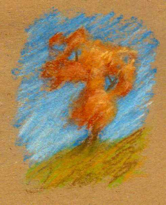
Below is an autumn tree sketch done with the Sanguine, Earth Orange and Peach colors against a spectrum blue sky shaded up with white. I used Olive green on the hill, but decided to jazz that up with a little of the muted orange so that it'd have more variegation. That made it stand out better against the sky and look more lively.
Test out color ideas like that in a small way. This is another good sketchbook exercise, something to do if you don't have much time for your daily art but want to keep the habit. Working only a couple of inches tall keeps you from overdetailing and shows the effects of color just as well as a large painting.

What does the brown paper do in all this color play? It makes the warm colors brighter by reinforcing them. It also brightens the cool colors I used. Look closely at the above examples, the blues, greens and violets in particular. Brown flecks from the paper create the same shimmering intensity for those cool colors that the cool colors do for the muted-warms subjects.
It's okay in pasteling to let some of the paper color come through, or in sketching. Either of the two drawings is comparable to the kind of color study I might do out in the field if I saw a flower I liked or a tree against the sky.
A mid-value paper lets me see how light my light colors are easily and how dark my darks are. With some subjects I might just sketch in the shadows and highlights, letting the paper form the middle tones. Gray is more neutral but it'll work the same way. Brown gives more warmth though, and for landscape sketching it does more to help complement all those greens and blues of sky, foliage and water.
So when you're warming up to do a serious painting or when you get new supplies, consider charting them in a color wheel as well as a row of swatches. Mix any hues you use often and place anything not exactly in the spectrum brights around the outside nearest to its color family. Constantly redoing color wheels will help you handle the muted colors better. They too can form a good spectrum.
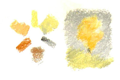
You can also use muted colors as a primary triad to see what happens. This exercise on white paper is a color wheel done with a muted primary triad from the same box of Conte crayons. Sanguine for red, the light orange/peach color for yellow and gray for blue. I used a little black and white in it too, mostly to darken the gray. It's the equivalent of something like the Zorn palette in painting, using warm colors with black substituting for blue.
It works well for two reasons. One, black pigments including those mixed with white to form gray sticks often have a blue cast in themselves. This is as true in paint as it is in pastel sticks, they're all done with the same artist pigments or inexpensive hue pigments.
The second reason is that a true neutral color, like gray, will take on the look of a complementary color to a color placed next to it. Put a red dot on a gray card and the card will look gray-green. Or here, where I placed an orange-reddish autumn tree sketch against a gray sky, it looks like a blue sky albeit not a bright blue sky. The gray mixed with the peach stick and a little black in the darker areas turns greenish because the blue cast of the black mixes with the yellow in the peach stick.
That light color looked much pinker on the brown paper by itself. On white it looked more like a warm yellow. So what values and hues are around any color will affect how it looks. The more you play with this, the more effectively you can handle it in a painting. Wouldn't an autumn forest against a stormy gray sky make a powerful scene?

So experiment with your mediums. Art journals are great for this, along with other sketchbooks. The more you play with your art supplies, the more masterfully you'll handle color in a serious painting. This is also something you can do when you're not feeling inspired, or if you feel discouraged about the quality of your painting.
Just doing color wheels and mixing diagrams starts to remind you how fun it is. You may get an idea from a subject by the exact mixture you created or by trying out a weird triad like substituting the secondaries for primaries. Green, violet and orange as your three mixing colors will produce an interesting but coherent color harmony - why not test them out in your art journal?
Enjoy!
Wonderful! Thanks for posting this up! I suck so bad with colors. I agree that the color wheel is a very useful tool. I remember having to do one in college, and honestly, it was a bit tricky to be honest (or I am just that stupid) when it comes to trying to get close to the primary blues, yellows, reds and so fourth cus of the fact that there are more than just one red, blue and yellow. I had a hard time with trying to get the correct pigment tube of blue for the assignment.
ReplyDeleteNow, I have to go catch up on other Blogs you posted since my absense from Blogspot lol.
Wow, thank you! It's a little easier to understand when you have multiple reds, blues and yellows, to place all of them in color order around the wheel.
ReplyDeleteTest each of the paints on a little slip of paper, bookmark sized. Draw a large circle on a big piece of paper and lay out your slips. If two paints are exactly the same hue, like Hansa Yellow and some brands of Cadmium Yellow Light or Pale, overlap them to show they're the same hue.
Once you have that big color wheel, you can use it again and again for any mediums, dry or wet. Just make slips that fit into it and then paint up a color wheel using the paints in their relative positions. Moving the slips around will help you know where to paint your swatches for a permanent record in your art journal.
I think I'll do this project and describe it for next week, since it would apply to any medium and be permanently useful to have available! With pastels you could lay out the entire sticks around the wheel to see where your palette is strong and where it's weak.
ReplyDelete