Monday, December 26, 2011

Watercolor Memories


Early in my grade school years, I got a 100 Colour watercolor set for Christmas. I don’t remember who brought it, Santa or my Dad or either set of grandparents or one of a large group of aunts or uncles. It came from the UK and may have been made by Reeves. The hinged-lid tin, an actual metal paintbox, carried a jolly cartoon scene of a circus with elephants and other animals and a little British flag. It spelled Colour fancier than Americans did, something that charmed me. It seemed more artistic to paint with Water Colours than ordinary watercolor.

Inside, as advertised on the tin lid, it had 100 colours in small rectangular hollows about half the size of half pans. Some of them were opaque. Sea Green, one of my favorites, blazed out of its pan. They were organized by hue systematically although at first glance it had gaps because at least a third of them looked black in the pan. The glorious brush was a size 2 or 3 or 4 round with a beautiful point. I think it was decent quality synthetic rather than cheap sable because it didn't shed like the cheap sable brushes and held its point.

I could not understand how the brush makers had managed to make all the hairs curve inward toward the point instead of turning this way and that. It didnt wobble on the handle. It didn't shed. Most of the brushes I had then shedded as much as my cat, usually right on the painting. Somewhere that tweezing the hair out would wreck an important detail like an eye.

Many of the colors had pigment names. That was also my "Swallow the Dictionary" stage of life so I memorized Raw and Burnt Umber, Raw and Burnt Sienna, looked them up in the encyclopedia and found out that pigments changed color when roasted. Also that “Dirt ground fine” was one of the main ingredients in paint and people would travel across several countries to find red dirt or green dirt.

I learned the difference between Vermilion and Viridian even if it took most of a year to be able to remember which was blue-green and which red-orange when I wasn't home to check the set. I’d write down my best guess during the school day when I thought of it, spell them right and check my beloved tin as soon as I got home.

I learned that Magenta wasn't just beautiful but essential. The color wheel mixtures worked if I used that for my choice of red. I learned that Sea Green was opaque while the "black" looking pans were very transparent colors. I learned that Alizarin Crimson used strong was exactly the color of those deep red roses I thought were so cool and could never paint properly. I learned that Ultramarine made violet with either of those and the blue-greens didn’t. I discovered Payne’s Grey was the color of storm clouds and giggled at the name.

I think back now and my joy wasn't just that my giant British monster set had 100 Colours. It taught me a lot more than I realized. I thought of it as silly for years, but writing about it now, that jolly tin with the elephants on it taught me so much about painting in any wet medium.

I also think that set was why I didn't give up on watercolor. All normal kid sets were immensely frustrating. Paper cockled, blunt annoying brushes couldn't get detail or work small and controlled, transparency stumped me, mud resulted even from simple two-color mixes. Opaque colors and white let me add light colored details after the dark areas dried completely. Combining them in the same set was brilliant on the part of that UK manufacturer. Up till then, I’d never even seen white paint in a watercolor set.

Between my good 100 Colour monster set and fine waterproof pen lines, I solved the problem of getting accuracy in watercolor by combining it with pen drawing. My dad gave me a Crowquill pen early on and eventually a real Rapidograph pen size 00 along with India ink that came in a bottle, dried waterproof and stained anything pure black. Once I looked at 19th century engravings and botanicals, I got hooked on pen and watercolor. Most of the giant 100 color set went into attempts at realism because I was small and had no interest in Modern Art whatsoever.

Today I can start out with a primary triad and produce a good painting. Back when my age was a single digit number, trying to do that resulted in unsatisfying browns and murky grays. I didn’t understand that sometimes gray grapes with brown leaves can be beautiful. That took much later practice and study.

I also got an actual wirebound watercolor pad with that lovely tin. It vanished rapidly even though I painted on the backs of ugly paintings. It cockled less and was wonderful to work on. I think that’s also where I got set in the habit of liking the sizing instead of stretching watercolor paper.

The last thing that gorgeous watercolor tin taught me was how to take care of pan watercolors. Up to that point I’d treated watercolor sets as badly as any kid. Lids broke and got cracked, colors mixed together inextricably, brushes got lost, I used them until they were unusable and then begged for pocket change until I could get another. The tin was special. It came from far away. It had colors that couldn’t be replaced even with birthday money. Sets with 16 colors were much more useful than the 8 color cheap sets with their orange cast reds but the grand British tin was something I’d never see again. When the Sea Green was gone, I’d never be able to use it again.

It took some practice to be able to clean out a pan watercolor set well enough that the staining colors scrubbed out of the palette surface and the spaces between the pans weren’t filled with mud. I paid attention to rinsing out the beautiful pointed round brush and for a long time carefully threaded it back into the little clear protective tube that slid over the hairs. I washed off the lid too, got everything as close to perfect as I could because that made it easier to use.

In the middle of one of the best holiday seasons I’ve had in my life, with a long holiday call to my family, art supply presents sent back and forth, surprise gifts from friends and a humble but incredibly self indulgent holiday feast eaten with pure laziness, something reminded me of that perfect gift. I left behind my full range set of 72 Derwent Inktense when I moved. I finally spent some birthday money on a bundle with a 12 color tin of Inktense and a big multimedia journal after checking that yes, Magenta was included along with Violet.

A friend of mine surprise gifted me with the 72 color full range tin again. I opened the package with no idea what it was and that giant tin was even more special than ever. I feel the way I did when I first tore off the wrapping paper and saw my "100 Colours Watercolour Tin." Maybe it's "Big range, British, Fancy, In A Nice Tin" that's always led to an explosion of creativity!

My friend knew how I felt about big ranges. She knew how often I use Inktense pencils in my journal and how much I love vivid, strong transparent colors. Her gift was completely unexpected, just like the 100 Colours UK Elephant Set was and it expanded my vision just as much again.


If large ranges confuse you, relax about it. They’re freedom to experiment. Each pigment or mixed-pigment convenience color reacts a little differently in texture and mixtures, it might be more opaque or make brighter oranges or greens or violets. It might mute them while creating fun effects when another that’s exactly the same hue gives no granulation.

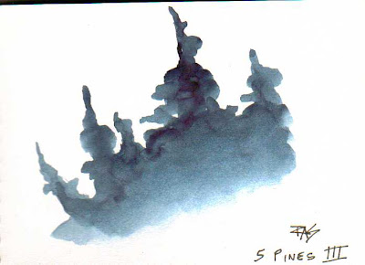
I’m able to create a good painting with a primary color triad now that I’m grown. Having a big set lets me do that with a wider variety of primaries to choose from, or even work with a secondary triad and have few or no pure primaries anywhere in the painting. The example pen and wash pieces at the top of this article were done with a tiny 8 color pocket set I put together with Daniel Smith favorites.

As you rest up from the holidays, play with your new toys and digest all those treat foods, say hello to your favorite mediums. Try something you haven’t done before or choose a different combination from the biggest set you have. It’s one of the best ways to feel like a kid again - in a way that makes you a far better grown artist.

Happy Holidays!

Saturday, December 17, 2011

Work and Play


Here's the quote from Harley Brown that inspired this entire essay.

“HOW IT HAPPENED
At the start of my adult life, I felt like I was thrown into the middle of a lake and had to swim for shore. Any shore. No time to worry if people liked me or my art; or if what I was doing was "worthy." I'll tell you why:

There were two things I knew for sure: I wanted to be a full time artist for the rest of my life. And I didn't want to "work" for a living. Whatever else has happened, I've stuck to those very goals. Yet, I really don't give myself a pat on the back; there are many who've worked as hard but had tougher obstacles to overcome. Many of them, my heroes.

In retrospect, I did what I did with a naive young mind that didn't, (thankfully,) understand the Real World. I still don't understand the real world. Thankfully. Harley Brown”


Gee, that’s familiar. His words are different, but I could swear that came out of my old spiel when I worked as a street artist in New Orleans. I’d grin at the tourists and say “I used to work hard at a real job in Chicago, then I moved down here and decided I’d rather play all day and paint. Would you believe it? I eat better and I’ve got more actual luxury than when I was living on ten times as much, because I’m not blowing it all shopping in order to get over the stress.”

What happened to that attitude? What happened to that feeling that left me so crushed I literally didn’t want to draw or paint at all until 2004 when I decided I might enjoy it again if I kept it strictly a hobby?

I fell down and I couldn’t get up. I walked too far dragging too much stuff because I didn’t understand that all physical activity takes me five times the body energy. I moved too far from my setup spot. I dreamed of getting an electric golf cart or something as a convenience when that literally would have saved my career.

I also fell down emotionally the very first day that I had no sales at all. Up to that point, street art was self reinforcing. I trusted that I would get at least one or two sales every day I got out there. I could budget anything I wanted by how many days I wanted to work, versus stay home and do something else including loaf around. (Read, sick days that I thought I was just being lazy.)

This week I made a very minor mistake that brought up that big realistic fear - that if I don’t do this right, I will get back on the Boom and Bust cycle. Do my best, fall down flat and be unable to continue. As well as so burned out I don’t even want to draw a cat gesture for years.

Thursday my prints rack arrived. I got excited and overestimated how much I could do. I was so excited about having my license and everything I need to go out and do street art that I was also trying to get several days worth of preparation done by morning and then get a full night’s sleep. I got all worked up about it, Thrills and Chills, adrenaline can be read either as excitement or fear.

Well, when it's a mix of excitement and fear when both have good sound reasons, that can get a bit stressful. Stress + Fibromyalgia = Sick Day.

Instead of a full night’s sleep, I was too stressed to sleep at all and went to bed at six in the morning only to get up at nine in the morning unable to sleep. I didn't cut any mats because resting till I felt up to getting up, I stayed up too late to get it done and still sleep that night. So I had to call it off and reschedule. No deadline now. I'll go out when I have everything done.

Instead of my glorious debut on the Street Artist Program, I had a lousy sick day in which I did nothing but sit around fielding panic attacks over everything that could go wrong. Then writing an email to a friend and deleting it over and over for eight hours.

Doing that solved the problem. I did not bother sending her the 30,000 word long version. I needed to pretend that my sensible friend would read it in order to be "thinking it through from another person's point of view."

This is a comeback trail from the biggest failure of my life - something that I threw everything I had into getting past the obstacles and keeping it afloat. I was happy in that job but I hit too many crises and bang, down I went. I have spent all the years since then figuring out why I couldn't keep doing it.

I left out one of the big reasons. Stress + Fibromyalgia = Sick Days. Art does not sell on Sick Days. Or on stressful unhappy worried days. Street art sells best when I am happy to be there, thrilled to see a customer, delighted with my project, overflowing with real contentment. My art is happy and has affectionate undertones. My portraits, while not flattering in any technical sense are emotionally flattering. I look at the subject positively to bring out the best in their personality, so they come out looking good with every wrinkle and wart because those became lovable.

I have to actually feel like being with people and painting, even if what I'm selling isn't portraits.

I didn't take morale into account. Street Art was self reinforcing. Instant Cash doing something that's legal and fun, goofing off instead of actually working and being paid for it, what's not to love? That's a daily reward. If I got even one sale, walking away with more money than I went out with made me happy and made me want to do it again. Because I got that money for nothing. I did not need to suffer for it. I didn't have to Care About The Money. I wasn't doing it just to Plod Through a Hated Day Job.

I was goofing off having fun and getting paid.

Then I sold art to people who by their circumstances have up to a year's spending money in hand that is now budgeted for Have Fun and Goof Off. We are on the same wavelength, me and the tourists.

Half the natives I knew in New Orleans grumbled about "God, I hate tourists.” They always ask directions and assume you know, they don't dress or act the way you do. Heck, they're on vacation having fun while you're stuck working for a living and then they demand your time. Oh and they're rude too. (Some of that is "They're not from here and their idea of Polite does not match yours.")

I met a few annoying people but I didn't categorize all Tourists as Rude. Most of them were nice to me. They at least complimented my art. They looked at me like I was a tourist attraction same as the famous churchyard where duels took place. Fair enough, that's what I was doing! This was great and I loved them. It took genuine extreme bad mood behavior for me to dislike a tourist.

I didn't get mad at "Where is the Cafe du Monde?" when it was right over there in sight from where I was standing. They never saw it before. That's a reasonable question. Not everyone's eyesight is good enough to read a sign from half a block away.

Then came the summer bad season, when I had a hard time making my nut - earning out my necessities at the top of the month. Summers were when I had zero sales days. Some summers I didn't have many because I still had that morale. I blew it off as “well, this is the off season and I have to get out more days to earn enough to make it.” I just didn't get much beyond necessity and had to physically overwork in order to make it.

The year it started to take off, when my art was getting into galleries and I'd already put two years on the waiting list for an "A" license, I had a personal crisis with a family member. It knocked me back hard with fibromyalgia symptoms. I had too many sick days, so I was reduced to "force myself to go" on bad days during tourist season. Every time I got a zero sales day, it was harder to make myself get up and go. By the time summer came, I could not earn enough during the month to survive.

I moved farther away from my setup to have cheaper rent because I had less money. So I was putting in extra physical effort to get out and work with less joy in it every time after that crisis. I took in annoying roommates in order to survive because I wasn’t earning enough to live by myself. I didn’t have the physical energy to clean my apartment and got in fights with those roommates about housecleaning, when they included slobs.

Annoying things that had been tolerable, that I'd blown off as no big deal, became overwhelming depression. That became a vicious cycle. If anything bad happened, that day turned into a zero sales day. I was running on the edge in terms of physical energy and financial survival and I was way over the edge in terms of emotional resilience.

Friday was when I sorted all that out and figured out what happened.

I have figured things out like this before. I used to be able to live within my budget whatever it was, but never able to save up money either in general or to get something big that I couldn't afford on one paycheck or windfall. I solved that when I was living with Kitten in a practical way. I decided I wasn't going to buy any Terry Pratchett books - my favorite author - unless I put $50 into savings first. If I did, I could go to Amazon and buy a book with what, under $10 of my spending money?

The game worked. I lost my savings to using it for crises several times and would like to save up to the point where a crisis doesn't obliterate it. I'd like to have some savings beyond the "for emergencies" level. An arbitrary reward system does it.

I might not have been gradually demoralized by bad days or bad customers if I could have counted on a self set reward every single day that I had the will power to get up, grab my stuff and go do it. The natural rewards of "I get to paint in the pretty place" are real too but if I'm hurting for money, fear overshadows that simple pleasure. I have to make any no-sale days that are just Plein Air on the Wharf worth doing and play the averages between "good days" and "bad days" loading it for success.

Literally the happier I am, the better my art is and the more customers buy it. There's something beyond just selling in an art career. Every sale is a thrill, a reaffirmation that “I’m an artist.” I'm sharing that thrill. Tourists who do something else for a living and did not spend years learning how to draw or paint have met a real artist. They saw me start from a blank piece of paper and create a beautiful artwork from scratch the way a master does anything well. They came into my studio. If they ever had any fantasy of learning to paint and asked questions, they became art students on the spot and got a lesson with their painting.

We, me and my client, are both enjoying ourselves in that moment. A warm human memory is going home with them along with the beautiful painting, which has an emotional undertone of "I love doing this and you are so awesome, you have great taste for spotting how cool this painting is. You bought real art instead of just going to the mall, so you're refined and sensible. This is real value, not junk. Also, you have talent. Keep sketching. Remember how I did that trick with the eye highlight. You will draw that well someday too whether it’s for fun or you want my job someday. The more the merrier."

All the good reasons why people buy art, from the fantasy of "I might have just got a pre-famous Van Gogh" to "God, that was fun" associate with something that's already beautiful in its own right. It’s a place or a face that they love. All my happiness in the process goes into the color harmonies and shape choices and what details I chose to focus on whether I’m conscious of that or not. So it’s a face or a place they love seen at its best on a good day. No wonder they fall in love! They were already in love!

I've never been able to do a Hard Sell, to put the money first. That's antithetical to why I'd rather paint and write than work. I can't "Close the sale" when a customer's not sure. I take no for an answer, that doesn’t work for selling insurance or encyclopedias or anything else I tried in pure sales jobs.

What I can do is a soft sell letting the real beauty and my real good mood turn into reality. They fell in love and when they get home it's still the painting they love, so they're happy. They got good value for what they paid and had a happy experience. I think sometimes I made their vacation, sent them off in a good mood that made the fancy seafood dinner taste better and the music at the blues bar more fun.

I have to care about the experience more than whether that customer buys or someone else does, trusting that if I'm having a good time someone will buy. A lot of times people want to and don't have the money. They went to a bar last night or they bought something in the shops first. They dithered and wished, wandered off and didn't come back. I didn't resent that. Heck, sometimes they rebudgeted and came back.

Putting those two things together, I’m going to manage my morale as much as my time and body energy. The “conditional self reward” system of Terry Pratchett books for savings worked. So I’m going to choose something small that I want to enjoy very often. It should be something I won’t get bored with.

So when I go out to sell art, I’ll budget five dollars for something from the convenience store. They have donuts and breakfast pastry, fruits, corn dogs, genuine Mexican Flan with Caramel Sauce in a little dessert cup, food treats. I can choose to stick the five bucks in my pocket if I’d rather eat hot oatmeal before going down and don’t feel like convenience food, that might stack up to pocket savings of another $10 Pratchett book.

Instead of making the treats specific, I’ll just budget some lunch money as a self reward. It also means that if I get hungry while I’m out there, a snack from a vendor on the spot to stay happy and have something to eat when I’m starting to get sick from hunger makes a sale later on a lot more likely. In fact, it wouldn’t hurt to also brown-bag it. If my sales even match what I did during the off season, they will become an important income stream to fund websites and self publishing and art supplies and business. If I like a restaurant down near the area I might save up my treats to eat out whether I sell or not.

I used to reward myself for good days by eating out before going home. I think that’s a good idea too. When I celebrated making my nut, I worked a little harder to get ahead. I did that as early as I could during the month so that I’d have the choice of either working harder for something big I wanted, or staying home to work on things that don’t pay as fast.

I honestly don’t know if I’ll “make my nut” within a month of starting the Street Artist program. It’s unlikely unless I count it by smaller goals. The first “made my nut” goal is “My license renewal is in the bank.” That’s minimal success for this season. Next level: business expenses and savings for contingencies at stepped levels. Then “a month’s rent in the bank,” and “rent plus bills in the bank” and eventually reaching the $2,000 maximum savings allowed by Social Security.

That is as much cushion as I can put between my leap to self employment and phoning up to quit my day job. It’s good for two months of minimal rent and expenses. Then either I’m making enough to live on every month and take the plunge, or I maintain that savings more or less around that level and keep throwing it into the business till I do earn enough to live on.

There are plenty of things I can invest in. A giclee printer and archival inks and paper, so I’ve got prints sales supplementing originals. Websites with affiliate links. Having my novels edited professionally before sending them to publishers or self publishing - a worthwhile expense either way.

I’ll decide the next milestones as I reach them, because I don’t know the details of my path to self employment. I’ll just keep moving in that direction until I get there and continue rewarding myself for every small achievement along the way. That will keep me going when the going gets tough and remind me why I love this lifestyle, why I’m goofing off for money instead of just going to work like a normal person.

When it’s a job instead of a hobby, that kind of planning and maintenance is one of my tasks. I enjoy it though. Deciding what I’m going to do always gives me a sense of empowerment.

I always plan for the worst case and the best case. Reality usually comes out somewhere in between. What could go wrong in the best case? I could earn so much that I’m bang, off Social Security in the first month I do it having to deal with working out my taxes and withholding and recalculating and changing my life in a major way without being sure if that level of sales will continue.

If I want to be sensible, I’ll pay attention to the seasons and make sure to have $2,000 in the bank. That’s either two months of so sick I can’t do anything or tap it to make up the difference in slow times and restore it as soon as things are better. Loans to self are repaid at a level with immediate business expenses like getting more mat board or more paper when I run out.

Whatever I’m doing, whether it’s keeping up a Nanowrimo word count or cleaning my room or building my self employment, getting ahead makes me want to do more of it. Catching up if I’m behind is emotionally hard and emotions affect this job. So getting ahead and rewarding myself tangibly for every step toward getting ahead will be my best shot at my year-goal.

I want to be self employed again in 2012. I don’t have to be over the poverty line, that’s another milestone and will take some planning to be able to get medical coverage. In that time I don’t want to worry about rent, food, bills or business expenses. That’s the big goal. It’s not minimal. What’s minimal on the Big Goal is “Closer to it than I am now.”

I need to know this market and its seasons. I need to learn my pace in this better climate, how many physical effort days I can do in a month with the rollator, later with a power chair. I need to find out how to pace a week and develop habits that let me get a full night’s sleep the night before an outing.

Yeah, I’m scared. It takes more effort to get up and go on a comeback trail than it does to tear off into a new adventure that might be wonderful. That’s okay though. If what I wanted was to never worry about paying the rent and bills again, I’d hang it up. I’d donate all my paintings to various charities and any proceeds of any of my books and just live on SSI doing whatever I wanted.

That’s okay though. Thrills and chills are both adrenaline and moving around burns that into activity instead of backfiring as aches. By the time I get off the short bus at the lottery spot, I’ll be ready. This is going to be awesome!

Wednesday, December 14, 2011

Art Journals and Paint Charts


Art journals, especially on watercolor or multi-media paper, serve a greater purpose than just chronicling your life and creating an artwork that's a compilation. They do that too. They are to painting what sketchbooks are to drawing. With wet media, they're also useful as a concrete record of what your exact supplies do.

When you set out to do a serious painting, you'll be able to flip through your old watercolor journals or multimedia journals and decide whether you want to use acrylics thinned down till they behave like watercolor, opaque watercolor aka gouache, transparent watercolors, watercolor pencils. Anything you've ever tried, you can get a good idea how it's going to behave in your art journal.

Beyond that, devote some pages to charting any new paints you get. My examples are in watercolor. I tend to purchase a lot of different watercolors. Daniel Smith is always tempting me with new triads, then I see something else on sale, a friend gives me a present, funny how it mounts up. It doesn't help that I came to painting out of doing pastels and colored pencils when it really does matter to have a green exactly one step yellower and one step lighter and one step duller than the last one. Or three different greens that go in each of those directions.

With paint, you have a lot more freedom for what to work with. You can even start with three tubes of good artist grade watercolor and get a great result just with that. Wow! Hey! Watercolor's the way to go then, right? Lots cheaper! You don't even need white if you're using white paper and being purist about it.

If you do this, the colors to start with are Permanent Rose (or some other magenta sort of purplish bright red), Lemon Yellow and Ultramarine Blue. You definitely want Ultramarine Blue because that is the workhorse pigment. Ultramarine Blue mysteriously gets used up fastest out of all the watercolors I've ever bought. In pan sets, that's always the little half-pan that empties out first and gets refilled most often.

Those exact three colors by name from Winsor & Newton will give you a good three-color starting set. Add Winsor Yellow (or Hansa Yellow Medium if it's Daniel Smith), Scarlet Lake and Pthalo Blue Green Shade and you have a wonderful Split Primary Palette that will let you mix all the bright colors there are as well as any grays or browns. These are the exact colors listed by Winsor & Newton in their very useful guides to paints and pigments on http://www.winsornewton.com, a site that has an enormous amount of information on painting.

But whether you go there or get the Daniel Smith Primary Triad or a Holbein starter set or any other brand, the first thing to do with your new watercolors is to chart them. Just like the image below.


Actually, since you haven't been collecting watercolors for years and testing them routinely, chart them a little more thoroughly than that. These are working charts, just the brand and color name. I'm familiar with all of these pigments since that little eight color set is something I threw together recently in my art journal. It's a reminder of the specific colors I chose to put into a little 8 color pocket set that I pried out the children's paint from to have something that fits on a keychain.


I've got my Split Primaries, Sodalite Genuine because it's a mineral pigment about the color of Payne's Grey that I like for both monochrome sketching and as a cool darkener, and Quinacridone Gold, which is just useful. I could have substituted it for the Indian Yellow since it is a warm (orange cast) yellow when it's thin. But I decided I wanted the Indian Yellow in too. It gives me a bit more variety in mixtures to have three yellows, that's a personal choice based on the pigment qualities.

A thorough, first-time beginner's color chart should be sorted out with a lot more written detail. It helps to use a Pigma Micron or some other waterproof, permanent archival pen so that the information doesn't get obscured or smudged if paint goes over the labels and so that the whole chart remains easy to read years later when you go flipping through old journals for where you wrote that down.

Also, if you're a total beginner, don't bother with the cheap student paint at all. Definitely get good artist grade paints and settle for fewer colors. It's more important to learn to mix the colors you want. Not only that, cheaper student watercolors don't always mix well or predictably. You can be trying to make something work, do it right, get horrible results and think it's you when it's poor quality paint that's why it didn't come out looking like the example in the book.

Pigments behave in different ways. Let's go back to that basic color wheel thing you got in kindergarten, or at least I did. You start with yellow, red and blue. Your teacher merrily says "Mix red and blue to get purple." You do it with kid paint and get gray, because the kid paint has an orange-cast red and a green-cast blue so that mixes up to a mixture of all three primary colors. Most of the kids just do what they're told. You being a young artistic genius glower at the results and complain to the teacher that it's gray, not purple. She says it's the pigments.

"Then how come we didn't get the right pigments to have it come out the way you explained?"

"These are just children's paints. Those are the colors they come in. You could mix a little purple into it if you wanted to get it more purplish."

"Then why couldn't I use the purple in the first place?"

I was that kind of kid. Trust me. If you use Winsor & Newton Permanent Rose plus French Ultramarine, you will get a nice strong purple suitable for irises, shadows under trees, that lady in a purple dress, anything you want to use purple in. When you're painting landscapes, a good strong purple is your friend because bright lemon-and-blue greens look horrible without it.

Lemon Yellow is your greenish yellow. Pthalo Blue Green Shade is your greenish blue. Mix those and you will get anything from eye-popping lime on down to eye-popping turquoise. When you want the colors bright, choose the primaries closest to each other on the split primary color wheel. When you want them more muted, as in the greens of pine trees or sagebrush or wilting lettuce or lawns that have not been kept up as if a landscape service was involved with daily sprinkling, use the primaries that include a little of the third color.

Indian Yellow and Ultramarine Blue make a pretty nice foliage green range, one that doesn't scream "Pokemon" to those viewing the painting.

So, that's your hues. The ones to start with anyway. You can expand this to having Warm and Cool versions of the secondary colors too - a yellowish orange plus reddish orange, a red-purple and a blue-purple, a blue-green and a yellow-green. That gives you loads of possibilities and will result in many more pure spectrum tone possibilities. You can do the bright full saturated spectrum type of painting with a 12 color warm-cool palette in any medium.

When you want neutrals and muted colors, you have the choice of single pigment paints that aren't as spectrum-bright in themselves, like the Earths. Burnt Sienna, Yellow Ochre, Indian Red, these are all earth pigments. So is Sodalite Genuine, which is a single pigment color. Payne's Grey makes a lovely "blue" for an Earths Triad but it's a mix of black and Ultramarine. However, when I have a mineral that's actually that blue-black to begin with, I have fewer pigments in my mixtures.

That means less mud.

That's why it's a great thing to have the 48 color Lukas 1862 half pans set or the 70+ tubes of Daniel Smith that I collected as well as everything else. I don't use all those colors in the same painting. I choose what's going into the painting I'm doing by exactly how each of those pigments or combination paints behaves in mixtures and on the type of paper I'm using.

This can make "materials study" a lifetime hobby in itself. Or you can wind up choosing a half dozen or a dozen good paints and know them to the core and never bother with anything else or any brand but your favorite. Artists vary. I started in pastels and colored pencils so I'm a pigments collector.

Make your chart by drawing a line with a Pigma Micron or some other completely waterproof, permanent pen across the page. A Sharpie is another good pen for this, just let it dry thoroughly so it won't be smudged.

Look at the information on the paint tube. Get out a magnifier to read the small print and if necessary look up all the abbreviations on the manufacturer's website. Artist grade paint should list the pigment or pigments in that color, whatever the color name is, whether it's Opaque, Semi-Opaque, Semi-Transparent or Transparent and how lightfast it is. You would probably like at least your best paintings to last for centuries in museums, so choose good lightfast colors in the first place.

The original Alizarin Crimson is not artist grade lightfastness. It has a slightly different hue (actual color) than Permanent Alizarin Crimson, which is an extremely transparent purplish red.

Looking at almost any standard 12 color pan set, you'll probably get Burnt Sienna and Yellow Ochre in there along with a dark brown. Burnt Umber is common for the dark brown, sometimes it's Raw Umber. The exact colors of these paints will vary with the manufacturer. But the first thing you'll notice with these Earth Colors in your brand-new 12 color field box of most artist grade brands is that they're opaque watercolors.

That is, they are opaque for transparent watercolor. If you want Really Opaque watercolor, go for Gouache. When you put the light colored or white Gouache over that black line, you can't see it. The white is like White-Out unlike the semi-opaque or semi-transparent Chinese White or Titanium Whites. If you try either of those, you'll find they are only opaque pure from the tube. Add any water and they start to show the black line through them.

You can still tint them with any of the other colors to get light colors.

Most of the acrylic colors are transaparent. Everything about Opacity, the Opaque through Transparent range, applies to acrylics, oils, every other paint medium as well as watercolors. So if you're kitting up in acrylics, do the same thing with the swatches but also buy some Titanium White, same with oils or any other paint, because you don't get the light colors without mixing some white with them. In fact, gouache is a good start for learning color theory and painting in general.

Why?

Messing with transparency is a pain! Learning to control transparent watercolor is the least forgiving, most difficult, most hair-pulling drive you to distraction insanity of any wet medium. However, it has these distinct advantages.

It's cheap compared to oils and most other paints. It's portable and compact. It doesn't take stinking up your house or having a lot of special mediums handy unless you start getting into special effects. It has a longer learning curve but it's also just darn handy, and any frustration you had with it as a child (all these things apply including "Your mom can clean it up just with water!") will give you an enormous soaring feeling of mastery once you can get it to come out the way you want it to. As an adult, or as a very well taught older child if you had good teachers or good supplies and online access.


I'd have killed to be able to paint that scene when I was a kid. You know what my kid paintings look like, you probably did some.

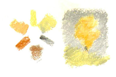
So. Back to charting your paints. Here's an example of a thorough chart. On the top are swatches of the same eight colors organized the way I would if I'd just bought them. Below are combinations of all three yellows with both blues and the blue-black Sodalite to make greens.


The stripe of black under the swatches will give you opacity. Now you're going to let it dry and take a wet brush and try to scrub out part of the stripe that's over the white part. I'm going to do the complete, decent version to test the eight pigments in my itty bitty kit as an example, but you should do this in a permanent record for every paint that you buy. Keep in mind that pigments come from different sources. The chemical ones get made in different batches with proprietary formulas and methods. The mineral ones get dug up in different parts of the world. They get milled to different sizes. The exact binder - what gums (usually gum arabic) and other ingredients (they can include things like honey) will affect how the pigments behave. The only way you can tell how your paint will act is to chart your paint.

Mark the brand along with the color name over each swatch too. Or at the top of the chart if all your colors are the same brand, as they are here.

Make the swatches long enough to give space to scrub out a patch on each of them and to fade out the test sample with more water toward the end. This group of colors includes Transparent and Semi-Transparent color, since I like having transparent colors for use with pen sketching. But if I went to a larger range, I'd probably have Raw Sienna or Yellow Ochre for an opaque earth red, might look for an opaque blue and Burnt Sienna, Indian Red or English red for an opaque earth red.

I have only one outright Staining color in this palette, Pthalo Blue Green Shade. I like being able to correct what I'm doing. Staining colors are rich and luminous. They give beautiful effects. Alizarin Crimson in either Permanent or original form is a staining color. You can have loads of fun washing it out of your cat's white feet when he runs through the palette of your oil paints leaving him three sky blue feet and one hot pink foot, the way I did back in New Orleans during an oil painting. If a pigment stains, it will stain in any medium.

This can be a very good thing if you want those stains not to move when you glaze other paints over them. Whatever the qualities of a given pigment, there are good uses for all of them. Problems come in when you wanted something smooth looking and the paint granulated, or you wanted a glaze but used a staining color, or you wanted transparency and the Yellow Ochre happened to be opaque. This palette is mostly non-staining, transparent or semi-transparent and I chose it for use over pen drawings as well as painting by itself. For other types of paintings I'd use other pigments.

You'll also notice that I have two different notes on "granulation." Daniel Smith lists Quinacridone Gold as a granulating color. Funny, it seemed pretty smooth to me on this paper, compared to how the Sodalite granulates. That's where your home tests really matter. I put "Except Thin" under it because for all I know, if I was using it from the tube instead of from a dried pan, it would granulate more. But these tests aren't from the tube, they're from the little palette with the dried patches. If I was charting these from the tube, the swatches might look different.

Definitely if I wanted to play with more opaque colors, I'd go for some Cadmiums. The thing about Cadmium Yellow through Orange and Red in their various incarnations is that the real ones are quite opaque, as opaque as transparent watercolor ever gets. In their time they were the strongest, brightest reds and yellows you could find too, they made a huge impact on a painting world that didn't have those screaming orange and yellow and red hues.

Today's Cadmium hues range from semi-transparent to transparent. I have yet to find one that's as aggressive in mixing or as opaque as the real Cadmiums. How you can tell if a color's aggressive is in the mixing. This is sometimes called tinting strength and isn't always listed on the tube. It's something you find out when you put one drop each of those colors together and let them mingle.

Pthalo Blue has an insanely high tinting strength. All three of the Pthalo Blue mixes I created look a bit stronger and darker because the blue was so strong. Even when I tried to use just a little dab with lots of yellow, I sometimes had to put more of the yellow in - like the top with the Quinacridone Gold, that odd effect is that I put more Quinacridone Gold in on the left while the patch was still wet.

Compare that with how the Sodalite or the Ultramarine reacted with those same yellows. I've basically got three yellows, three blues and two reds in that set. I might section off the middle with some dabs of glue to add two or three more color dots, if I do I might add a yellow earth and a red earth color to have three Earths for a muted palette.

If I wanted to put in a green neon sign in a cityscape, I might want that bright combination of Hansa Yellow and Pthalo Blue. But if I wanted sagebrush, I might use all three yellows and the Sodalite to have a nice variety of muted greens. When I want browns, I might add a bit of either red to those green mixtures.

You can do the same kind of paint charting with casein, oils, acrylics, any other kind of paint you have. If you are using student quality paints, the charts become even more important because that's how you can identify where mixtures don't come out the way you expected. A color can look like a perfect mid-blue to the eye and have enough yellow in it to give you a nasty surprise when you mix it with what looked like a mid-red.

Sometimes you want those muted colors. Very often landscape painters avoid using the purple-cast reds and lemon yellows so that the whole painting doesn't come out screaming bright neon green. Greens can be overwhelming in large areas. It can be a lot of fun to try different primary triads, or even substitute a black for the blue as in the Zorn Palette and other red-yellow-black primary palettes.

One fun exercise to do is create a simple still life or landscape scene from a good photo, one object or one tree, paint it small, and then using the same subject, redo it in several different color harmonies. Try this. It's one of the fun things you can do to make your art journal a good permanent reference for how your paints behave. Then when you're out there in the field doing a Spring Landscape Morning After Ice Storm, you'll be able to mix your colors with confidence and know which colors to bring in the first place when you glance out the window.

The other big advantage of watercolor journaling is the same one that daily sketching gives you. Paint small and often. Try everything and write copious notes in the text around the little paintings. I learned drawing first, that's just my particular path along the learning curve. You might decide you want to learn to draw by painting and keep a wet journal going right alongside your sketch journal, or do all your sketching in watercolor and gradually learn form, line, value, composition and all those things with a brush before you bother to pick up a stick to make marks with.

A good balance of both can be had by using watercolor pencils in a multi-media or watercolor journal, along with a waterbrush like the Niji, Sakura or Derwent waterbrushes. I've mentioned these before. They make watercolor sketching very easy and you can use your pencils like they were pan watercolors. Or just scribble out patches of pure color on the side of the page and treat those as pans, that's one way some artists avoid having to carry a paint set. Just put in the swatches before going out and bring the waterbrush.

When you do, chart them. Many watercolor pencils lean toward being opaque colors or semi-transparent instead of very transparent - they still function as colored pencils. The swatch tests over black will help you understand how they'll behave when you layer light color over dark. Glazes of pure color building up your darks can create a gorgeous, luminous effect. Transparent colors won't obscure your pen lines as much either. While you're at it, test the pens you have by dragging a wet brush over them to see if they dissolve, how much and what color the ink is when it's shaded out. Sometimes using watersoluble pens and a brush can give a lovely look too.

The cat sketches in my first illustration were done with a roller ball pen that I thought was waterproof. It wasn't. The soft brown that I mixed with Quinacridone Gold, a little Quinacridone Fuchsia and a touch of Ultramarine turned into a very grayish brown after I dragged color from the pen lines in. So I tried the pen without the paint and got a pretty good wash just with water. That's the sort of thing that I'm glad I discovered in a little cat study than if I was doing a street scene that I wanted to have bright colored elements standing out.

Have fun with it, paint often and do systematic tests of all your paints. That saves a lot of headaches in big paintings and it can give you all sorts of serendipitous results. Black and yellow do usually make some variety of olive green and when what you need is a good olive green, that's a reason to have some version of black in your paint box.

That was another kindergarten discovery, one that same harried teacher had no way to explain at the time. She couldn't explain why the blue, violet, black and green pans looked black in some watercolor sets and looked their real color in others. I know the difference now, it's called "Masstone" and refers to how the paint looks when it's laid on quite thick. Paint is fun. The best way to learn it is to chart the paints you have and then test them in various combinations and small paintings till your favorites start to emerge.

Saturday, November 19, 2011

Color Play 2 - Big Wheels!


Some of the author's pastels.

The Big Wheel is a good exercise for artists who have some floor space. You'll need a big piece of gray matboard or brown corrugated cardboard (the free version), a string, marker and push pin for a compass and of course, all the pastels or paint tubes that you want to organize. I would have set it up and taken a photo, but Life Happens and at the moment I've got no floor space to arrange a version of it. The photo above isn't all my pastels either.

However, when I make the time to clean all 275 of the pastels in my Dakota Traveller, I'll definitely consider doing this and snapping a photo for reference! Here's a photo of my biggest pastels box. I have them in color order so it isn't quite as urgent, but the Big Wheel would probably help me refine that.


Last week I posted a color wheel of my 24 Color Conte crayons, my most portable hard pastels. That was a useful project to show me how the colors mixed, see which areas the palette is strong in and which areas I’d be happy to get more colors. Yellow Ochre isn’t in the 24 color set, only an earth orange.

With paints, pastels or colored pencils, sometimes you’ll have colors that match if you mix more than one brand. In paints especially, whether acrylics, watercolors, oils, alkyds or gouache, you will find some colors that are exactly the same hue. A good example is the Cadmiums. Very often manufacturers have both the actual Cadmium pigments and less expensive hues that match the Cadmium colors precisely. Sometimes people even buy both.

I do, because Cadmium Red Light Hue, even if it’s an exact match, isn’t as opaque or aggressive as real Cadmium Red Light. Different pigments may have completely different mixing properties. The same amount of Cadmium Red Light and its Hue in a mixture with Ultramarine will be much redder with the original Cadmium. If they’re allowed to mingle on the page in watercolor, Cadmium is going to move farther into the blue area than the blue will into the Cadmium area.

Some watercolors granulate. Particles will settle out within an area as it dries, creating an interesting pattern. Others will dry completely smooth and clear. Which effect I want depends on the painting.

So the best way to handle this with paint is to get together all the tubes you have, cut some slips of paper or canvas paper about an inch wide and a few inches long. Use a hole punch to put a hole in the middle about 1/4” from one end.

Paint swatches on these slips. If it’s watercolor or acrylic, you can thin the paint out with water to make a gradated wash from a pale tint to the full mass tone - the darkest color right from the tube. If it’s opaque like gouache, tint the color up with white to the lightest tint you can mix.

With oils, acrylics or alkyds you can use canva-paper to make the swatch slips. This will also give you another useful bit of information to write on the back - how many days it takes that swatch to dry. Different pigments in oil paints dry at different speeds. Once you know this, it’s easier to estimate how long it’ll take for your painting to dry if you want to varnish it or paint wet over dry.

Once you have all the swatch strips created and dried, lay out a big circle on a white mat board or poster board. Mark it with twelve divisions and several inner circles. Lay out your swatches on the Big Wheel and arrange them by hue.

Because they’re separate little slips, if you think a blue is purplish but discover there’s a more purplish one and it should’ve been closer to spectrum blue, you can just move it. Often it’s easier to judge exactly where a color goes on the wheel without seeing what else is on the wheel. If you don’t have an exact spectrum color, such as a perfectly balanced emerald green that’s neither blue cast nor yellow cast, don’t worry about it. A touch of blue or yellow will push it toward the center and it’s useful for you to know that you don’t have a high intensity mid green.

Shades and mixtures can be put on swatch cards too the same way and laid out with your pure colors from the tube. Write down on the backs of the slips what brand, the color name and if known, the pigment number. There’s a number on tubes of paint like PB29 - that’s Ultramarine Blue. It stands for Pigment Blue 29, a specific synthetic ultramarine.

With hundreds of pigments that vary in transparency, opacity, granulation and lightfastness, choosing paint can be bewildering. It can also be exciting. Once you’re familiar with a pigment in one medium, you’ll find it easier to handle in another. Ultramarine is a big staple for me. I noticed that’s always the first watercolor tube that I use up, so I buy larger tubes of it just like I get bigger tubes of white in oils or acrylics.

Playing with my colors educates me on how to use them. It also gives me ideas for paintings. I’ll look at a cobalt blue and think of a jay’s iridescent feathers in spring sunlight. A strong greenish blue like Pthalo Blue might make me remember the sky in New Orleans, so much deeper and greener than a northern sky.

For dry mediums like colored pencils or pastels, you can use the Big Wheel to organize them before you even make the swatches. Then just copy the Big Wheel smaller into a large sketchbook page, pick up each pencil and mark it in its place with the color number of the product as a label. At the bottom, list the information like brand, color name and so on.

For mediums that smudge like pastels, pastel pencils, Pan Pastels, even soft colored pencils, you may want to laminate your swatches. Just buy a sheet of clear laminating film where you usually get your art supplies and cover the entire swatch after labeling. This makes the ring a permanent record. When you wear down a colored pencil to its last stub, or use the last paint in the tube, toss the tube and decide you need to replace it, you can check the swatch to discover what you need to replace.

Inevitably, I sometimes sharpen colored pencils from the wrong end. I’m left with a short stub and sometimes don’t even know what brand it was. Frustrating, but a good organized swatch system can help with that.

Separate swatches on a ring are also good for being able to add the new colors when you try a new pigment. When you start getting into experimenting with pigments, the number of tubes can grow until they’re unmanageable. Yet each of them is useful and some substitute easily for each other. Still others have such distinct effects that I choose the one that fits the painting.

I’ve noticed that the more choices I have at a time, the more likely I am to paint with a limited palette. It just isn’t the same one every time. It’s what exactly fits that painting.

When I had a dozen or two colored pencils, I often tried my best not to have to mix colors. Once I had a big set, I’d freely mix and often use tertiary colors in my mixtures. Lavender with a green glaze has a very rich effect but if I’m mixing just to get the lavender, I’m not as likely to get subtle.

Even iridescent or metallic colors have their own place on the color wheel. If it’s an interference color, lay it out by the color listed by the manufacturer. Interference colors flash back and forth between complements, so interference magenta is going to shift to green and interference green will flash magenta. You do have to make a decision on those, but they can still be organized on the color wheel. Metallic and interference colors often show up best on black surfaces.

If it’s a watersoluble stick, crayon or pastel, I make swatches shading by pressure to nearly white, then I wash back from the light end to the dark to show the color both wet and dry. Sometimes they can be dramatically different. Derwent’s Graphitint pencils are much more intense when washed than when dry. Both effects are useful - the dry colors are subtle and shimmer with graphite, the washed colors brighter but still muted with an eerie tone.

Now here’s some things to remember about color in all its possible forms, from automotive paint to soft pastels, watercolors, oils and food coloring. Oh yes, you’re an artist, food coloring counts. Tinted edibles may be an ephemeral art form but they’re fun to play with color on too. Why not do a giant sugar cookie, mix icing to various hues and intensities and paint a copy of a master painting on it? That could awe someone as a birthday present. Be sure to get pictures before it’s eaten.

Color has several properties.

HUE is what color it is on the color wheel. Red, red-orange, blue-green, violet, yellow, those colors. If you lay out all of your paints or sticks around the wheel, you can identify the Hue of any of them in relation to the others. Even sets of gray pastel sticks sometimes have all six spectrum colors in very muted form!

VALUE is not how much you paid for it. Value is how light or dark it is. Usually value gets described on a ten swatch scale, with black and white as the extremes. It’s a useful exercise to mix black and white paint to create eight evenly spaced grays and make your own value scale. It’s also nearly impossible. If you want to try it, purchase a cheap value scale card from any art supply company. Daniel Smith sometimes sends them out as a freebie with watercolor orders.

CHROMA or INTENSITY is how saturated the color is. Blue-gray has a low chroma. Bright spectrum blue has a high chroma. Blue gray isn’t very intense. Bright spectrum blue is intense. To see differences in chroma, lay out the colors on a gray piece of paper and see which one comes closest to the gray.

Muted colors with low chroma recede and are restful. They tell the viewer that object is farther away or less important or both. Brilliant intense high chroma colors pull forward. They attract attention and tell the viewer that object’s closer and more important.

You might want to use a gray mat board for your Big Wheel, so that sticks and swatches show how intense they are and what value they are next to as pure a neutral as you can get. It’s also why some palette paper is gray rather than white - it’s easier to judge value and chroma against a medium neutral background.

TEMPERATURE is the fourth quality of color. You got a simple version of this in kindergarten or first grade unless your school thought the arts were frivolous and it wasn’t taught.

Cool colors - blue, green, violet - recede and are restful to the eye. Warm colors - red, orange and yellow - are more attractive, draw the viewer’s attention and bring subjects forward in the painting. That’s simple enough.

But what if you’re doing a painting that’s got a red barn way in the distance and bright green grass in the foreground? Then you have to use some color tricks including temperature to push the barn back and the grass forward.

Split Primaries are a way to do that. Choose two yellows, two blues and two reds. You can even use split primaries and secondaries. The yellows are lemon yellow (closer to green) and a warm orange cast yellow like Cadmium Yellow Medium or Dark. The reds are an orange red like Scarlet Lake or Cadmium Red Light along with a purple cast red like Permanent Rose or Alizarin Crimson. The blues are a greenish blue like Pthalo or Prussian Blue and a purplish blue like Ultramarine.

When you mix a secondary color, choose the primaries that come closest to that mix. Orangy red and orangy yellow together make a very bright orange. Purplish red and purplish blue make a bright purple. This is the answer to the kindergarten problem in my last post - get the right pigments for your mixture.

But sometimes you want the green to be an olive green or the purple to be a grayish dusty purple. That’s when to use the “wrong” pigments, choosing a greenish yellow and purplish red will give a more muted, earthy orange. Orange-red and greenish blue will make a gray that’s somewhat purplish but more lively than a gray that’s just black mixed with white.

Other terms about color and pigments follow.

MASSTONE relates to paint and pigments. Masstone is the pure pigment without anything else mixed with it, like black to darken it to a shade or white to make a tint, or water to thin it. Masstones have different values. Prussian Blue and Pthalo Blue have almost exactly the same Hue, but the masstone of Prussian Blue is darker, closer to black.

OPAQUE or TRANSPARENT colors. Many paints are transparent. Opacity can range between completely opaque, semi-opaque, semi-transparent and completely transparent. Colored glass or clear plastic candy wrappers are completely transparent. Pastel sticks are opaque.

With paint, one way to test transparency is to use a permanent marker to make a black line down the middle of your swatch card. How much the contrast of the black line against the white card shows will give you an instant view of how transparent that paint is. If you’re lightening with white, transparent colors become more opaque the more they’re lightened. The swatch card will show you how light you have to make it in order to cover another color on the painting.

Gouache is completely opaque, more opaque than opaque watercolor pigments. It’s mixed with some white pigment and other opaquing fillers to give complete coverage. This is useful for its own properties and it comes closest to using pastels of any wet medium.

When you’ve charted and organized your art supplies, it’s much easier to decide what to use for a given project. The next step is to just play with them. Experiment on different surfaces. Do small studies to see how they handle and layer. If you record your observations in a sketchbook or bound art journal, it can become a permanent valuable reference for anything you want to do in that medium.

I hope with this article that whatever your favorite art supplies are, you’ll have fun finding out what they do, what the properties of each color is and how they mix. Methods of mixing colors are something for another article. Have fun, play with your stuff and get inspired by color!

Sunday, November 13, 2011

Why do I paint?


Pastel sketch on light blue Canson paper, Autumn Leaves by Robert A. Sloan

Because I didn't want to work hard, just play all day and have a good time.

Seriously, this is not a bad way to avoid working for a living. You get to do what you want, when you want. You get an artistic license to be as weird as you want and people just think that's a sign of creative genius. I'm a 56 year old man who fusses over kittens and cats. I purr at my friends in conversation. Who else but an artist or a novelist can get away with that?

I had a nightmare of a childhood with many undiagnosed physical disabilities. The normal things children did were all impossible or so difficult they precluded each other. I could get my homework done OR I could do my chores, never both. I had to get up at ouch in the morning, walk farther than my body could manage, endure gym, go to classes that ranged between extremely dull because I already understood everything before I walked in, or impossible because I was slow in that subject.

I limp to a different drummer.

Everything in my life before I was legal age was scheduled and mandated by other people who didn't understand either my limits or my abilities. If I wasn't so far behind I didn't make it to the starting gate, I was so far ahead that I fell asleep out of boredom and exhaustion.

The one exception was art class. Back in the day, art teachers mostly believed in "Do what you want to" and "Be yourself." I'd come in a roiling mass of dark rage and my art teacher would let me sit down, play with colors and do anything I wanted for an hour.

New art supplies and mediums were a constant joy. In actual classes I got to try things like making linoleum prints, stamping with carved potatoes, painting with acrylics, watercolor, drawing with charcoal - I loved charcoal, an early sign that pastel was one of my best mediums.

Whatever I did, they raved over it as wonderful. Art teachers were not prejudiced against the exceptional child. They didn't tell me "Stay back with the rest of the class" if I read ahead or through outside reading discovered something cool. If I wanted to copy Hieronymous Bosch, an art teacher wouldn't say "That's too morbid and bizarre."

They'd just encourage me and if I got it right, they'd rave over it.

When I painted a demon, they didn't tell me I was going to hell for even thinking about one. They though it was great, it was so full of emotion.

My dad taught me scientific illustration with careful stippled pen drawings of fossils and life drawings of my pet white rat that let me draw other rodents easily. He had a Tom Lehrer album on which the great comedian joked "If you can draw well, you'll never flunk biology."

He was absolutely 100% right. Drawing well carried me through every life science class. I turned in the best diagrams and sketches, college level when other kids were doing wobbly stuff.

Why did I get so good so darn fast? Because whenever I had art lessons or time left alone to play with art supplies, I dug into it and practiced with the learning curve and single minded intensity of a bored child. Regular teachers sometimes stepped on me. I remember a grade school teacher who gave me a hard time for trying to draw people with volume and shading when I was supposed to do stick people and flat houses with curlicue smoke from the chimneys.

The thing is, her opinion didn't carry the weight of an actual Art Institute class for young painters. She was obviously a grade school teacher. Lower on the educational totem pole than a specialist. The specialist, who taught adults and college kids too, raved over my Black Painting in acrylics.

I had invented impasto and reserved white when I decided I wanted to do a black cat climbing out of a coal scuttle at midnight. I just used most of a tube of stiff black acrylic paint and sculpted the cat around two green-yellow eyes with slit pupils, sculpted the coal with a palette knife, all the highlights were reflections on the shiny paint.

He used my black painting as an example and credited me for inventing it. Even though I'd reinvented something that was used for centuries, he made me feel like a genius for thinking of it myself rather than reading it somewhere.

I can do whatever I want in art and other people will like it.

My first commission was a scientific paper illustration for my dad. I drew a fossil in pen and ink and a life reconstruction of the little animal, a type of rodent "Something like a gerbil or kangaroo rat" that was close enough to a white rat that I got it right. Dad critiqued the pencils till I got them right and I spent hours carefully stippling and inking with many examples in science books. It was actually published. I got paid with a genuine Rapidograph technical pen, which I wish I still had.

Back then, Rapidographs looked like high end fountain pens with fat cigar-shaped black bodies, a discreet color tip showing the nib size and of course piston fill inside so you used them with bottled ink. Someday when I'm rich I'll hunt down a vintage one just to replace the long lost trophy of my first sale.

He was family though. I didn't realize "people like me and let me do whatever I want" could replace actual work until I was in my twenties. I did some art to sell at a science fiction con, by my current skills it was awful. That didn't matter. I went in and someone in the registration line bought a dragon sketch for a dollar to put on a button.

I sold everything I brought. I realized art could be turned into real money without having to work hard for it. A corollary was that expensive art supplies paid for themselves. Toys that pay for themselves! I loved my big 72 color set of Prismacolors and the first thing I did after the con was to buy replacements for all the blue and green ones I used up doing the 9" x 12" shark painting that sold.

I lived on the cheap and bummed around. I fell in love and moved to San Francisco, where art was a steady side income between random low pay jobs when I was tired of being broke. I moved to Chicago to get a better job, turned into a workaholic, wasted the entire decade of the 1980s working hard as a typesetter, drawing on weekends and breaks. I sold art at conventions on weekends.

After moving to New Orleans, I got another job that paid a third of what I got in Chicago but had lousier working conditions. I didn't regret it when I got fired on a technicality a month later. I got mad. I decided I should give it a shot living just on art, so I brought my portfolio down to the French Quarter and showed it door to door at shops and galleries.

A commission for a large pencil drawing for a poster got my rent paid and 50 of the posters to resell at market price. I wish I still had one, the last few got damaged in a flood a decade ago. I did the convention art to live on for a year, then when that market dipped I did pastel portraits on the street with a $29 "B" license for the happiest years of my adult life.

Unfortunately some bad decisions like moving farther away from my setup areas and not saving up for the summer slack season meant I ran my health into the ground and couldn't continue that.

Now I've moved to San Francisco and gotten help for my disabilities. I live on SSI and I've got a business doing art and writing about art on websites and also writing science fiction and fantasy. I've just paid my $166.08 Street Artist Program license fee.

The best occupation I ever had, the easiest source of fast cash in a pinch is back in reach again. I lived on it when I wasn't permitted to use the best high traffic spots on a "B" license in a city that had only seasonal tourism. San Francisco's tourism is year round. I've got transportation. I've got help with the things I can't do. Another local artist is buddying up with me because I know the business and he doesn't mind helping me carry stuff or set up - the things that held me back weren't the painting part.

So I'm hoping to be self employed again soon. It may take a while to get out of the poverty income range, but I lived better under the poverty line when I did art and didn't work than I ever did when I was working class and had three times the money. Believe it or not, I had more spending money as a $4,000 a year artist.

So I'm back to my life as experience taught me it should have been. I could fold it up, retire and not have to work for a living at all. I could just live on my SSI and take it easy for the rest of my days. But I'd get bored and there's no substitute for that magical moment of watching someone watch me paint and their jaw drops. Street art is a performance art too, it's like being a magician. There's this paper and these colorful little things and bit by bit, they see someone real or some place real come looking out of the paper better than life, forever caught in a moment of splendor.

I'm a better painter now by far, largely through hanging out at WetCanvas.

I'm looking at all the professionals I know here and thinking - maybe I don't need to stay under the poverty level. Maybe I can build a business that'll make me middle class without a Job as such or having to wear a tie. It would be cool to have more money, to eat better, eat out if I'm out painting, have other luxuries.

The thing is, the lion's share of those luxuries will go into the studio. That's where my spending money goes when I have it.

So I paint to avoid having to work and get money for nothing.

I know that's just a feeling. I have skills honed over years and use them well. I use the best materials and craft my works as well as my German grandpa ever did a weld. I'm working hard. It doesn't feel like working hard when I write or paint though, because I'm that into it.

The more people in this world who quit working hard in favor of doing what they love so much it doesn't feel like work, the happier all of us will be.

Next week - Color Play II: The Big Wheel. I continued from yesterday's Color Play article and wrote another one with an interesting project.

Saturday, November 12, 2011

Color Play


In pastels or any dry medium, the more colors you have, the easier it is to create the best effects. My ideal palette has all the primaries and secondaries in warm and cool versions with at least two tints and one shade of each, plus some muted colors, grays and earth browns also with tints and shades. Of course I don't always have my ideal palette at hand, especially if I want to sketch outdoors.

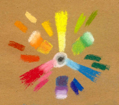
Above is a color wheel with every stick in my 24 Color Conte set laid out on medium brown Aquabee Bogus Recycled Rough Paper. White, gray and black form a bull's eye at the center. Yellow at the top, red at the left and blue to the right is a common primary triad layout.

If you didn't get this in grade school, the color wheel is the first thing most people learn about color. Primary colors are red, yellow and blue. They can't be created by mixing other colors. Secondary colors are orange, green and violet, which can be mixed by various proportions of spectrum primaries. Inevitably using children's art supplies, the red and blue produce a murky gray.

"It's the pigments" is what my kindergarten teacher told me as I scowled at that muck. "The red and the blue pigment aren't pure, they have a little yellow in them, so it turns gray." I was mad that the manufacturers had not included good spectrum primaries in the tempera line. Today's kid paints usually do, so I must not have been the only disgruntled kindergartener.

But the color wheel is much more useful than you'd think. Everything has a hue. A gray can be a blue-gray leaning toward green or toward violet, a brown might be closest to red, orange or yellow. Mix complementary colors (exact opposites on the color wheel) and you mute them. They become brownish or grayish but may still retain their identity. The color of my laptop case is actually a metallic deep dark orange.

When you make color wheels with any new art supplies, you begin to find out exactly what those mixtures can do and what you can do with them. You can also use color to create or control emphasis in any part of a painting later on when you've thoroughly experimented with your supplies - including a short palette of a dry medium. It's one thing doing color harmonies with 132 Prismacolors or more - recently they pushed that up to 150 and I know I need those other 18 pencils. It's much harder when you only have 24 sticks and really want three tints and a shade of every spectrum hue including tertiaries like red-violet or yellow-green and a good range of muted colors with their tints and shades.

I mixed my primaries by overlaying them. Red and the spectrum blue mixed evenly. Yellow and Red or Yellow and Blue took double doses of yellow, one under and one over, to get a secondary hue between the primaries. That's the kind of thing I test out with a new dry medium when I create these charts and color wheels. I blended with my sticks but you can do optical mixing by crosshatching or dotting, or finger smudge to get a smooth blend. It's your color wheel, do it your way.

I also wanted to place every stick that isn't a pure spectrum hue where it belongs on the circle. I put tints going inward by just going over the colors with the white stick, since a small set of color Conte doesn't have light yellow, light pink, light blue or even a couple of versions. It takes practice mixing the hue and value you want, although these hard pastels are particularly good mixers.

Then I put the secondary hues next to their mixed versions and tinted those up too going toward the outside. Very useful information if I'm sketching on the spot. I'd rather find out in a diagram like this that I need to use very little violet and a lot of white to get lavender, or that the purple stick is more red-purple than pure purple.

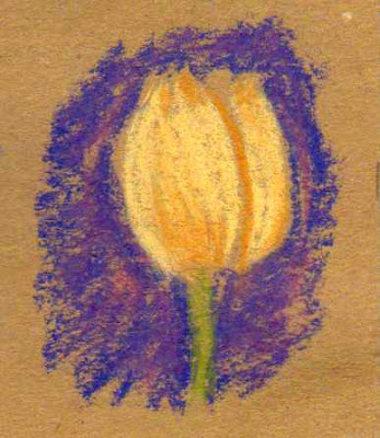
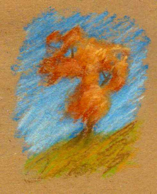
One thing that can be very useful is to look at the colors you have and see what combinations suggest themselves. My Conte set naturally includes Sanguine, a dark orangy red, and an earth orange that's more muted than the orange stick. The blue is very bright, but using white to lighten it and shades the sky also mutes it a little. If I want to sketch autumn foliage, I'll get a richer effect using the sanguine, earth orange and peach stick than I would using the bright orange stick. The complementary background would possibly make a bright orange tree too garish.

Here's how it looks in combination:


But if I want to make a more muted color look bright, using a fully saturated complement or near-complement behind it will do so. The dark blue-violet stick is a good match for the peach stick as a complement, using it as if it's a yellow. This could work with a yellow ochre tint too. I used the muted orange stick to shade it rather than the bright orange. You can see how it pops out against that background!

Below is an autumn tree sketch done with the Sanguine, Earth Orange and Peach colors against a spectrum blue sky shaded up with white. I used Olive green on the hill, but decided to jazz that up with a little of the muted orange so that it'd have more variegation. That made it stand out better against the sky and look more lively.

Test out color ideas like that in a small way. This is another good sketchbook exercise, something to do if you don't have much time for your daily art but want to keep the habit. Working only a couple of inches tall keeps you from overdetailing and shows the effects of color just as well as a large painting.


What does the brown paper do in all this color play? It makes the warm colors brighter by reinforcing them. It also brightens the cool colors I used. Look closely at the above examples, the blues, greens and violets in particular. Brown flecks from the paper create the same shimmering intensity for those cool colors that the cool colors do for the muted-warms subjects.

It's okay in pasteling to let some of the paper color come through, or in sketching. Either of the two drawings is comparable to the kind of color study I might do out in the field if I saw a flower I liked or a tree against the sky.

A mid-value paper lets me see how light my light colors are easily and how dark my darks are. With some subjects I might just sketch in the shadows and highlights, letting the paper form the middle tones. Gray is more neutral but it'll work the same way. Brown gives more warmth though, and for landscape sketching it does more to help complement all those greens and blues of sky, foliage and water.

So when you're warming up to do a serious painting or when you get new supplies, consider charting them in a color wheel as well as a row of swatches. Mix any hues you use often and place anything not exactly in the spectrum brights around the outside nearest to its color family. Constantly redoing color wheels will help you handle the muted colors better. They too can form a good spectrum.

You can also use muted colors as a primary triad to see what happens. This exercise on white paper is a color wheel done with a muted primary triad from the same box of Conte crayons. Sanguine for red, the light orange/peach color for yellow and gray for blue. I used a little black and white in it too, mostly to darken the gray. It's the equivalent of something like the Zorn palette in painting, using warm colors with black substituting for blue.

It works well for two reasons. One, black pigments including those mixed with white to form gray sticks often have a blue cast in themselves. This is as true in paint as it is in pastel sticks, they're all done with the same artist pigments or inexpensive hue pigments.

The second reason is that a true neutral color, like gray, will take on the look of a complementary color to a color placed next to it. Put a red dot on a gray card and the card will look gray-green. Or here, where I placed an orange-reddish autumn tree sketch against a gray sky, it looks like a blue sky albeit not a bright blue sky. The gray mixed with the peach stick and a little black in the darker areas turns greenish because the blue cast of the black mixes with the yellow in the peach stick.

That light color looked much pinker on the brown paper by itself. On white it looked more like a warm yellow. So what values and hues are around any color will affect how it looks. The more you play with this, the more effectively you can handle it in a painting. Wouldn't an autumn forest against a stormy gray sky make a powerful scene?


So experiment with your mediums. Art journals are great for this, along with other sketchbooks. The more you play with your art supplies, the more masterfully you'll handle color in a serious painting. This is also something you can do when you're not feeling inspired, or if you feel discouraged about the quality of your painting.

Just doing color wheels and mixing diagrams starts to remind you how fun it is. You may get an idea from a subject by the exact mixture you created or by trying out a weird triad like substituting the secondaries for primaries. Green, violet and orange as your three mixing colors will produce an interesting but coherent color harmony - why not test them out in your art journal?

Enjoy!

Monday, November 7, 2011

Water Brush and Brush Pen Sketching


The little painting above is my homework for "Essentials of Painting Trees" by Johannes Vloothuis, current in a series of fine art courses presented by WetCanvas Live! You can join the course late and still get the benefit of the classes by viewing the streaming video on a password-locked page for paid students. Previous courses are available for download from North Light Books.

I've been taking Johannes Vloothuis classes ever since he did his first Free Trial test of the GoToMeeting webinar software in December 2010. The master literally used his free trial to the max, for thirty days an increasing number of students spent four to six hours every day watching and participating in his lectures on all aspects of landscape painting. He redid the course and presented it again from December to April. All the downloads are available at North Light Books.

Now he's started doing classes on specific topics in depth. We had Buildings and Mountains, now it's Trees, next time I think it'll be Water. Because he had short "Trees" segments in his two general courses and I took notes, I have hundreds of little brush pen sketches of evergreen or deciduous trees in my notes. Some were copies of examples Johannes sketched on the screen with the webinar program. Others were my brush pen sketches as examples of what he was talking about.

So when he assigned "Group five evergreens together in a single mass, don't use color, just do them as a shape," I played with it. I got out my Winsor & Newton Field Box, where I've substituted Paynes Grey for Ivory Black and a Niji Waterbrush.

The brush is a nylon watercolor round, about size 6 or 7, with a water receptacle in the handle. Fill it at the sink or if you're out in the field, from your water bottle. Tap the little black regulator cap back into the receptacle and screw the brush tip back on. You can now paint with watercolors without keeping a water cup handy.

This is handier than anything else for quick watercolor sketching in your art journal when you're out. There's no need to juggle anything but the watercolor pans or palette and what you're painting on. You can even handle both while standing up, it helps if your pocket pan set has a thumb ring on it to hook a finger through.

So I did a couple of versions of the homework assignment, striving for graceful abstract shapes and a melodic line at the base of the mass. Then on this third painting in a 3" x 5" wirebound all-media sketchbook, I did something different.

I laid the water brush down at a steep angle, maybe only about ten or fifteen degrees up from the surface of the paper while I painted the tree silhouettes. I swished the tip in the pan to pick up color and didn't try to bring the color all the way up the hairs. So the tip had the strongest color and the base of the brush head was just clear water.

I got a dramatic result by accident on my first go - a soft gradation of color at the bottom of the grouping that looked like ground hugging fog below a hillside. I quickly added more details and areas to the top of the trees with the tip but I kept the brush at an angle as I progressed across the page. I worked fast, not letting the paint dry till I was done.

You can see some of the places where value varies from my additions to the trees. But the base came out with that smooth, gorgeous gradation.

So try this at home with a water brush. Tip the brush with color and then lay it down at an angle. Establish a hard-edged form above and a soft-edged gradated wash at the bottom. It's not that hard when you get the knack.

You can also use this from side to side on rounded objects. Just tip the brush with color and lay the brush nearly flat to the side, then move along the contours of the shape. While it's still wet, you can charge other colors into the wash.

Water brushes were developed in Japan. The first one I ever encountered was from Sakura, included in the 12 color Sakura Koi Pocket Box watercolor set. The pocket brush version is very short but will last through one to three post card sized paintings without refilling depending on how much water you use. Later on they put a full length water brush in the 24 color Sakura Koi Pocket Box, which has a lid designed to hold a postcard sized sheet or block.

I tried other brands. My favorites are Niji and Derwent. You can also use the same "tipping" technique with watercolor pencils and a water brush. Just run the tip of the brush over the tip of the pencil and then apply at an angle to the paper. The color will shade out beautifully to bare paper in a perfect soft edge.

Back when I got my first Sakura Koi 12 color Pocket Box, I was also exploring Japanese sumi-e painting - ink sticks ground with water on a suzuri stone, painting with natural hair Chinese or Japanese traditional brushes. Many of those are rounds that come to a good point. The tipping technique showed up in two instruction books I got from my local library as a sumi-e technique.

You might consider getting a library book on Sumi-E - Yolanda Mayhall's "The Sumi-E Book" is an excellent source if your library has it. Any technique in sumi-e can be duplicated with watercolor and a round brush, the mediums work well together. The biggest difference is that sumi-e ink does not rewet after being painted.

What I found was that using a water brush to practice the sumi-e strokes gave me instant results. It was so easy that I kept on doing sumi-e inspired sketches like the pines above as almost watercolor doodles. I thought I was just playing with it, goofing around. After all, it wasn't the classical medium with the correct brushes and stone and ink sticks.

What practicing in watercolor with a water brush did was to bring some of the principles of Sumi-E into my other art. I internalized some of the conciseness, some of the compositional ideas, most of all the understanding that I could convey a lot with only one calligraphic stroke.

I don't mean calligraphy as in Western calligraphy, like German black letter, Old English or Irish Half-Uncial. I do that too and it's fun. When I say "Calligraphic stroke," I mean the types of strokes used in Chinese and Japanese calligraphy, kanji and Chinese ideograms. Expressive brush strokes where the pressure and direction change constantly.

I also took out a book on Japanese kanji and practiced some letter forms in my journal at that time with the water brush.

I highly recommend this practice. Get to the library, get some books, get a water brush and start doodling in watercolor. Lately I've been hearing critique from master artists about my pastels or pen drawings that I have an Asian feeling to them, or I have conciseness. This even affected my pastel painting!

What works with a brush in wet mediums can sometimes work with a stick or a pencil in dry mediums. The idea of getting across more information in each stroke, of painting as if it was poetry rather than the novelist approach of describing every detail will affect all of your art.

So practice it the easy way. Water brushes were invented in a country where brush lettering is the calligraphy. Like brush pens, they were designed for quick fancy writing as much as for painting pictures. So give it a go!

Doodling with brush pens like the Pitt Artist Pens or Tombow dual tip brush pens is another way to practice calligraphic strokes. Tombow sets now include a colorless blender that's essentially a water brush with a foam point instead of a hairs point. You can blend out soft edges after the fact with the Tombow pens if you use the colorless blender pen. I haven't tried it by dipping it in paint, though I should since I've got four of the ten-color sets and thus four colorless blenders. I can afford to wreck one or stain it by using it in a watercolor pan.

Brush sketching isn't the same thing physically as pen sketching. You'll develop a different "hand" and set of motor skills with the water brush doodling and brush pens. I specifically recommend the brush pens because they make painting fast and easy. With zero setup, you can try to paint-sketch something in two to five minutes instead of having to go find your watercolors, get out water bottle, set up something to hold your stuff and then get started painting. By that time your dog or cat has moved, or the sun changed.

You might not even have it with you when you go to the supermarket. But if you put a small art journal or multimedia pad in your pocket along with any pocket set of half pans and a water brush, you'll always be prepared to capture a sunset, an interesting tree branch, a gesture of a teenager sitting on the curb.

Try to depict your subject as fast as possible in as few strokes as possible. With short practices on impulse scattered throughout the day, your painting will improve as fast as your drawing skills do with fast pen or pencil sketching.

Have a go! It doesn't matter if a few doodles come out badly - what matters are the ones that come out striking, far better than you expected. Date everything you do so that you can see your progress. Within weeks you'll find your paintings in all mediums start to improve from this practice.