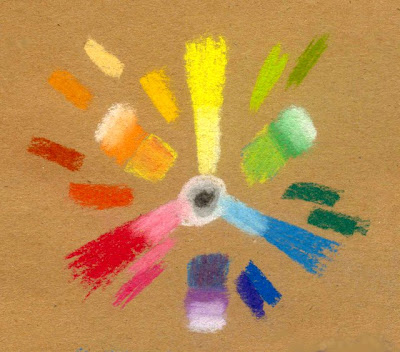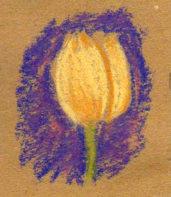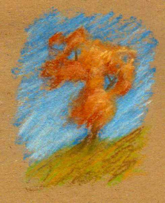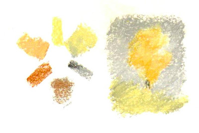
Some of the author's pastels.
The Big Wheel is a good exercise for artists who have some floor space. You'll need a big piece of gray matboard or brown corrugated cardboard (the free version), a string, marker and push pin for a compass and of course, all the pastels or paint tubes that you want to organize. I would have set it up and taken a photo, but Life Happens and at the moment I've got no floor space to arrange a version of it. The photo above isn't all my pastels either.
However, when I make the time to clean all 275 of the pastels in my Dakota Traveller, I'll definitely consider doing this and snapping a photo for reference! Here's a photo of my biggest pastels box. I have them in color order so it isn't quite as urgent, but the Big Wheel would probably help me refine that.

Last week I posted a color wheel of my 24 Color Conte crayons, my most portable hard pastels. That was a useful project to show me how the colors mixed, see which areas the palette is strong in and which areas I’d be happy to get more colors. Yellow Ochre isn’t in the 24 color set, only an earth orange.
With paints, pastels or colored pencils, sometimes you’ll have colors that match if you mix more than one brand. In paints especially, whether acrylics, watercolors, oils, alkyds or gouache, you will find some colors that are exactly the same hue. A good example is the Cadmiums. Very often manufacturers have both the actual Cadmium pigments and less expensive hues that match the Cadmium colors precisely. Sometimes people even buy both.
I do, because Cadmium Red Light Hue, even if it’s an exact match, isn’t as opaque or aggressive as real Cadmium Red Light. Different pigments may have completely different mixing properties. The same amount of Cadmium Red Light and its Hue in a mixture with Ultramarine will be much redder with the original Cadmium. If they’re allowed to mingle on the page in watercolor, Cadmium is going to move farther into the blue area than the blue will into the Cadmium area.
Some watercolors granulate. Particles will settle out within an area as it dries, creating an interesting pattern. Others will dry completely smooth and clear. Which effect I want depends on the painting.
So the best way to handle this with paint is to get together all the tubes you have, cut some slips of paper or canvas paper about an inch wide and a few inches long. Use a hole punch to put a hole in the middle about 1/4” from one end.
Paint swatches on these slips. If it’s watercolor or acrylic, you can thin the paint out with water to make a gradated wash from a pale tint to the full mass tone - the darkest color right from the tube. If it’s opaque like gouache, tint the color up with white to the lightest tint you can mix.
With oils, acrylics or alkyds you can use canva-paper to make the swatch slips. This will also give you another useful bit of information to write on the back - how many days it takes that swatch to dry. Different pigments in oil paints dry at different speeds. Once you know this, it’s easier to estimate how long it’ll take for your painting to dry if you want to varnish it or paint wet over dry.
Once you have all the swatch strips created and dried, lay out a big circle on a white mat board or poster board. Mark it with twelve divisions and several inner circles. Lay out your swatches on the Big Wheel and arrange them by hue.
Because they’re separate little slips, if you think a blue is purplish but discover there’s a more purplish one and it should’ve been closer to spectrum blue, you can just move it. Often it’s easier to judge exactly where a color goes on the wheel without seeing what else is on the wheel. If you don’t have an exact spectrum color, such as a perfectly balanced emerald green that’s neither blue cast nor yellow cast, don’t worry about it. A touch of blue or yellow will push it toward the center and it’s useful for you to know that you don’t have a high intensity mid green.
Shades and mixtures can be put on swatch cards too the same way and laid out with your pure colors from the tube. Write down on the backs of the slips what brand, the color name and if known, the pigment number. There’s a number on tubes of paint like PB29 - that’s Ultramarine Blue. It stands for Pigment Blue 29, a specific synthetic ultramarine.
With hundreds of pigments that vary in transparency, opacity, granulation and lightfastness, choosing paint can be bewildering. It can also be exciting. Once you’re familiar with a pigment in one medium, you’ll find it easier to handle in another. Ultramarine is a big staple for me. I noticed that’s always the first watercolor tube that I use up, so I buy larger tubes of it just like I get bigger tubes of white in oils or acrylics.
Playing with my colors educates me on how to use them. It also gives me ideas for paintings. I’ll look at a cobalt blue and think of a jay’s iridescent feathers in spring sunlight. A strong greenish blue like Pthalo Blue might make me remember the sky in New Orleans, so much deeper and greener than a northern sky.
For dry mediums like colored pencils or pastels, you can use the Big Wheel to organize them before you even make the swatches. Then just copy the Big Wheel smaller into a large sketchbook page, pick up each pencil and mark it in its place with the color number of the product as a label. At the bottom, list the information like brand, color name and so on.
For mediums that smudge like pastels, pastel pencils, Pan Pastels, even soft colored pencils, you may want to laminate your swatches. Just buy a sheet of clear laminating film where you usually get your art supplies and cover the entire swatch after labeling. This makes the ring a permanent record. When you wear down a colored pencil to its last stub, or use the last paint in the tube, toss the tube and decide you need to replace it, you can check the swatch to discover what you need to replace.
Inevitably, I sometimes sharpen colored pencils from the wrong end. I’m left with a short stub and sometimes don’t even know what brand it was. Frustrating, but a good organized swatch system can help with that.
Separate swatches on a ring are also good for being able to add the new colors when you try a new pigment. When you start getting into experimenting with pigments, the number of tubes can grow until they’re unmanageable. Yet each of them is useful and some substitute easily for each other. Still others have such distinct effects that I choose the one that fits the painting.
I’ve noticed that the more choices I have at a time, the more likely I am to paint with a limited palette. It just isn’t the same one every time. It’s what exactly fits that painting.
When I had a dozen or two colored pencils, I often tried my best not to have to mix colors. Once I had a big set, I’d freely mix and often use tertiary colors in my mixtures. Lavender with a green glaze has a very rich effect but if I’m mixing just to get the lavender, I’m not as likely to get subtle.
Even iridescent or metallic colors have their own place on the color wheel. If it’s an interference color, lay it out by the color listed by the manufacturer. Interference colors flash back and forth between complements, so interference magenta is going to shift to green and interference green will flash magenta. You do have to make a decision on those, but they can still be organized on the color wheel. Metallic and interference colors often show up best on black surfaces.
If it’s a watersoluble stick, crayon or pastel, I make swatches shading by pressure to nearly white, then I wash back from the light end to the dark to show the color both wet and dry. Sometimes they can be dramatically different. Derwent’s Graphitint pencils are much more intense when washed than when dry. Both effects are useful - the dry colors are subtle and shimmer with graphite, the washed colors brighter but still muted with an eerie tone.
Now here’s some things to remember about color in all its possible forms, from automotive paint to soft pastels, watercolors, oils and food coloring. Oh yes, you’re an artist, food coloring counts. Tinted edibles may be an ephemeral art form but they’re fun to play with color on too. Why not do a giant sugar cookie, mix icing to various hues and intensities and paint a copy of a master painting on it? That could awe someone as a birthday present. Be sure to get pictures before it’s eaten.
Color has several properties.
HUE is what color it is on the color wheel. Red, red-orange, blue-green, violet, yellow, those colors. If you lay out all of your paints or sticks around the wheel, you can identify the Hue of any of them in relation to the others. Even sets of gray pastel sticks sometimes have all six spectrum colors in very muted form!
VALUE is not how much you paid for it. Value is how light or dark it is. Usually value gets described on a ten swatch scale, with black and white as the extremes. It’s a useful exercise to mix black and white paint to create eight evenly spaced grays and make your own value scale. It’s also nearly impossible. If you want to try it, purchase a cheap value scale card from any art supply company. Daniel Smith sometimes sends them out as a freebie with watercolor orders.
CHROMA or INTENSITY is how saturated the color is. Blue-gray has a low chroma. Bright spectrum blue has a high chroma. Blue gray isn’t very intense. Bright spectrum blue is intense. To see differences in chroma, lay out the colors on a gray piece of paper and see which one comes closest to the gray.
Muted colors with low chroma recede and are restful. They tell the viewer that object is farther away or less important or both. Brilliant intense high chroma colors pull forward. They attract attention and tell the viewer that object’s closer and more important.
You might want to use a gray mat board for your Big Wheel, so that sticks and swatches show how intense they are and what value they are next to as pure a neutral as you can get. It’s also why some palette paper is gray rather than white - it’s easier to judge value and chroma against a medium neutral background.
TEMPERATURE is the fourth quality of color. You got a simple version of this in kindergarten or first grade unless your school thought the arts were frivolous and it wasn’t taught.
Cool colors - blue, green, violet - recede and are restful to the eye. Warm colors - red, orange and yellow - are more attractive, draw the viewer’s attention and bring subjects forward in the painting. That’s simple enough.
But what if you’re doing a painting that’s got a red barn way in the distance and bright green grass in the foreground? Then you have to use some color tricks including temperature to push the barn back and the grass forward.
Split Primaries are a way to do that. Choose two yellows, two blues and two reds. You can even use split primaries and secondaries. The yellows are lemon yellow (closer to green) and a warm orange cast yellow like Cadmium Yellow Medium or Dark. The reds are an orange red like Scarlet Lake or Cadmium Red Light along with a purple cast red like Permanent Rose or Alizarin Crimson. The blues are a greenish blue like Pthalo or Prussian Blue and a purplish blue like Ultramarine.
When you mix a secondary color, choose the primaries that come closest to that mix. Orangy red and orangy yellow together make a very bright orange. Purplish red and purplish blue make a bright purple. This is the answer to the kindergarten problem in my last post - get the right pigments for your mixture.
But sometimes you want the green to be an olive green or the purple to be a grayish dusty purple. That’s when to use the “wrong” pigments, choosing a greenish yellow and purplish red will give a more muted, earthy orange. Orange-red and greenish blue will make a gray that’s somewhat purplish but more lively than a gray that’s just black mixed with white.
Other terms about color and pigments follow.
MASSTONE relates to paint and pigments. Masstone is the pure pigment without anything else mixed with it, like black to darken it to a shade or white to make a tint, or water to thin it. Masstones have different values. Prussian Blue and Pthalo Blue have almost exactly the same Hue, but the masstone of Prussian Blue is darker, closer to black.
OPAQUE or TRANSPARENT colors. Many paints are transparent. Opacity can range between completely opaque, semi-opaque, semi-transparent and completely transparent. Colored glass or clear plastic candy wrappers are completely transparent. Pastel sticks are opaque.
With paint, one way to test transparency is to use a permanent marker to make a black line down the middle of your swatch card. How much the contrast of the black line against the white card shows will give you an instant view of how transparent that paint is. If you’re lightening with white, transparent colors become more opaque the more they’re lightened. The swatch card will show you how light you have to make it in order to cover another color on the painting.
Gouache is completely opaque, more opaque than opaque watercolor pigments. It’s mixed with some white pigment and other opaquing fillers to give complete coverage. This is useful for its own properties and it comes closest to using pastels of any wet medium.
When you’ve charted and organized your art supplies, it’s much easier to decide what to use for a given project. The next step is to just play with them. Experiment on different surfaces. Do small studies to see how they handle and layer. If you record your observations in a sketchbook or bound art journal, it can become a permanent valuable reference for anything you want to do in that medium.
I hope with this article that whatever your favorite art supplies are, you’ll have fun finding out what they do, what the properties of each color is and how they mix. Methods of mixing colors are something for another article. Have fun, play with your stuff and get inspired by color!


