Wednesday, February 29, 2012

Blocking In, Blending and Light


Blocking In is a technique often used in pastels. The general idea works in any medium but this article focuses on soft pastels techniques. Simplify the forms of your painting to big shapes. Ignore details and small areas unless those are in the focal area or demand reserved white.

Above is my block-in for "Lady Sunshine," a tabby cat painting. I did this one for a Pastel Spotlight challenge on http://www.wetcanvas.com that shares the same subject as this essay. DAK723 wrote a wonderful essay and demonstration of Blocking In.

Why do it? Several reasons. It lets me define light and dark masses in the painting so that when I finish it, I still have unified masses. It changes the color of the paper. I used a light gold piece of Canson Mi-Tientes on the smooth side and blocked in with Color Conte hard pastels. I worked lightly, just establishing areas of light and dark.

Most times I would smudge the block-in with my finger. This time I decided to go with sticks blending and keep the background very loose. I knew I could go back over that dark blue with a gold or reddish gold stick or play with olive greens over it to get a very natural variegated background hinting at foliage.

In a simplified version of the Colourist Method (which I will go into in later lessons) I used cool colors in the shadow areas and warm colors in the light. Most of this painting is in shadow, the cat is backlit and I really liked that dramatic lighting. The sun's coming over that bush or hedge or whatever to strike her from the upper left - mostly upper, more than left. It's on her forehead, it's all up and down the side of her we don't see and it catches the fur at the edges of her body with a delightful glow.

So I deliberately left bare paper around the block-in for the cat's shape. I put in a couple of dark marks for her features, mostly just placed her eye and a nose detail. I used a warm violet to block in her body because I wanted to stay a little close to the final color of her fur. Violet shadows are very natural, red-browns over it will give it a cool muted look.

So there's the block-in. When doing it, you can adjust the big shapes but on an animal, accurate proportion is important. Pastels are easily corrected. When it's a landscape, it's much easier to completely change the shapes to make a better composition. With a live animal those changes are limited by its anatomy. I added a bit more cat to the reference photo and was able to place her shoulder blade under the fur because I got used to sketching Ari from so many angles.

To get used to sketching cats, read my earlier article, How to Draw a Cat. This is what to do once you have a good cat sketch and want to copy and enlarge it to do a good cat painting.

You can enlarge your sketch mechanically with a copy machine or using your scanner as a copy machine. Just set it to enlarge and then move it around on the pastel paper till you have it where you want it. Rub some dry pastel on the back in a color that contrasts with the paper and works with your subject - violet sketch lines are often good for many subjects. Then trace the lines of your sketch and keep them simple.

Block in the shapes with a piece of a stick of hard pastel. I turned the pieces of my color Conte crayons on their sides to get big loose rough strokes.

Blending this block-in is a good idea on white paper. That will eliminate white specks completely. I liked the gold paper and didn't mind having a little of that show through either on the background or on the cat so I didn't blend the block-in at all. That's a decision to make per your painting.

The sketch-enlarge-block-in method will work for any subject, but cats are one of my specialties. So here she is finished - "Lady Sunshine."


What I did after the block-in was another layer just establishing basic color. I should have scanned that stage - I laid in red-brown over the cat shadows and olive green over the blue background to get it closer to true color. From there I began working over it with a variety of colors. I brought a touch of dark violet into some areas of the background, some dark brown, some yellow ochre and burnt sienna and more olive greens. I even used a few strokes of turquoise.

I decided to push the background into the distance so lightly finger-blended the background to diminish its importance.

Finger blending in pastels always dulls the colors. It'll give beautiful soft edges the more you do it and let a little bit of color go a long way. It gives beautiful gradients and shading. It will also diminish the intensity of colors a little and lose the "sparkle" that makes pastels such a rich medium.

By blending the background and using sticks to blend colors on the cat, I pulled her forward and gave her more texture. She's in focus and the background's not.

I worked over the edges of her fur with a white stick, pulling strokes out in the direction of the fur. Using three different shades of bluish gray, I started following the reference for her markings. She looks like a swirl tabby, doesn't have the little even stripes or spotted stripes of a mackerel tabby. Some stripes were more prominent than others. I also scumbled lightly over the red-brown with a light gray to lighten some areas and bring it more into a "Brown tabby" range than a ginger cat redhead color.

I didn't have a nice assortment of grayed browns in my set. The color came out richer for my using a bright red-brown followed by a little bit of gray. Why that color doesn't really show other than shifting the hue of her brown stripes but the dark gray "black" stripes show prominently is how hard I pressed.

Try this at home. Lay down an underpainting in one color, then add a related color one step over on the color wheel fairly heavily, then go over that very lightly with a near complement to mute it. Practice with the last color to see how much effect you get pressing lightly, barely touching the paper with the stick, pressing medium, pressing hard and really grinding down on the stick.

How hard you press the stick and what kind of motions you use in pastels make all the difference.

Finally I went into her light areas with white, ivory and a light yellow ochre color. I detailed her face, which is definitely the focal area. I put some whiskers in with the white stick and then applied SpectraFix fixative. I used a little too much so I wound up restating her whiskers with pastel pencils.

Final details, I used flesh pink, yellow ochre, ivory, red-brown, blue-gray and white pastel pencils to adjust small areas of color and shade between that brown area and the highlight on her face next to her nose. She doesn't actually have white fur there, it's just sun glinting on her shiny face fur.

Work with a good reference photo or work with your life sketches while your cat is actually in the room. Your colors will be a lot truer if you're looking at the real cat while you're painting.

Last tip - reserve the most detail and the most contrast for the focal area. Tat is her eye and generally her face. Her face markings show up stronger than the stripes on her neck and back. The contrast of her backlit fur is continuous but the soft edges of it down away from her face help give a fuzzy impression - as opposed to crisp strokes on her eye, the detail of her ear, her nose.

Enjoy! Definitely try this at home. You can copy my cat if you want to or you can have a really good time painting your cat from the best of your life sketches. Be sure to pay attention to the direction of the light and the shapes of shadows. If you draw the shapes of shadows accurately, you will have the shape of the form right and on top of that you'll give it good three dimensional volume. Don't let your cat sit in the pastels tray though!
Sunday, February 19, 2012

Waterfall Demo Hard Pastel Techniques


If you have Color Conte sticks, Faber-Castell Polychromos pastels, Sanford Nupastels, Derwent pastels, Cretacolor Pastels Carre, Gallery Mungyo Artist Semi-Hard Pastels or Richeson Semi-Hard Pastels, you've got Hard Pastels. They come in sets of 12 to 120 in different brands. Usually they're narrow firm square sticks that can be used interchangeably or with Conte Crayons. The only difference with the Conte crayons (including Color Conte) is that those are baked to give them a different texture.

Pastel pencils are close enough to hard pastels that you could try these techniques with them. The biggest difference is that pastel pencils can't be turned on their sides for wide strokes. I didn't use that technique in this painting, so feel free to get out your Carb-Othellos or Derwent Pastel Pencils, whatever brand you have.

I used a smaller 24 color set of Color Conte to create this Waterfall Demo painting. It's actually my homework for a free all-levels beginner to master class by Johannes Vloothuis, "Essentials of Painting Waterfalls" - find out more at ImproveMyPaintings.com if you want to register and attend the final watercolor demo in the three-part series or register for future classes. Upcoming topics include Rocks and downloads of previous courses including Skies, Trees and other landscape topics can be found at the North Light Shop. The downloads aren't free but they're loony cheap compared to other high quality art instruction videos. You can also check out the downloads of last year's "Paint Glorious Landscapes from Photos" three month course and either order them all at once or buy each in turn as you work through them depending on your pocket money. The cost definitely falls into "pocket money" for anyone with a job and the videos are fantastic.

Mr. Vloothuis will also make a large Photo References pack available at North Light Shop - if you tried to find it at ImproveMyPaintings.com and got confused, that's why the buy link wasn't there. He's expanding it too, even more good images to work from.

Yes, I am still a student as well as a teacher. I'm not even going to try to convey everything Johannes Vloothuis taught me about painting waterfalls. Because I did my homework painting in stages and took progress scans of it, I'll focus on a different lesson - hard pastels techniques. If you have pastel pencils instead, they're pretty much the same thing except that you can't turn a piece of a stick on its side to scumble. I use the tips for most of my techniques so pastel pencils are fine.

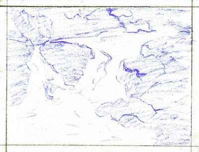
I used a blue-violet pastel pencil for my initial sketch on Art Spectrum Colourfix Suede. This is a coated pastel card very similar to ClaireFontaine PastelMat. It's good stuff - a little pricy but it holds many more layers than plain non-sanded pastel paper or sketchbook paper would. Work lightly if you're using plain paper. Sanded pastel surfaces like regular Colourfix or Uart or Ampersand Pastelbord will take more layering. The last thing you need besides some hard pastels (or pastel pencils) and a surface is a kneaded eraser for lifting color to restore tooth if you change something or have trouble lightening a detail.


I can't repost the photo Johannes Vloothuis provided for our homework assignment, but I'll describe how I arrived at this sketch. First, I opened it on my laptop and enlarged it bigger than the window. I tugged the window to the shape of my paper and then moved the sliders till I got exactly the crop I wanted.

I loosely sketched the shapes of the rocks and water, freely changing them to make them look better in my painting. This is another way to use photo references. You can move things around. You can add things from other photos or work from your own previous life sketches. Don't copy the photo. Think of light and dark masses like a notan, just shapes that make an interesting pattern.

I loosely scribbled over the darker areas to have that connected design because the blue-violet was one component of my rock color. Violet makes a good sketch color because it harmonizes with every landscape hue. Even if you work over it so completely that you can't see it, it will darken yellows without turning them green and blend in better than charcoal, which can change hues more. I had so many blues in this painting that I wasn't worried about it being a bit bluish. I'd use a medium value violet that was less blue if I didn't have that much rock shadows and blue water shadows.

Pastel pencils are a little easier for this kind of linear sketching. You don't need one though if you haven't got it handy. A hard pastel stick gets a line just as good if you hold it at an angle and roll it in your hand to use the different corners for a tight line or small detail. When you've rolled it around a few times the tip will wear down into a cone with a point. Scribbling in the dark areas, I held it at an angle and got a nice chisel tip back on the square stick with sharp corners for detail. In a way hard pastels are more convenient because they are self sharpening.


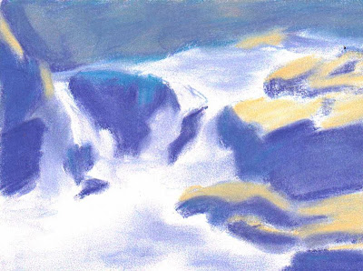
My second stage is the Block-In. I filled in the dark rock areas with flat color using a slightly darker blue-violet Color Conte and finger smudged them so that I'd preserve the tooth. I used pink and orange on some rock highlights in the back but smudged the blue-violet right over them to make a more muted color. I used a light Peach stick for the highlights on sunlit rocks. The background cliff is entirely in shadow, so it's all some variation on blue. The sunlit flat planes are a bright light peach because I wanted a bit of dawn color in the composition. You could use any warm color.

Using spectrum bright colors in the BLock-In stage gives a shimmer of strong color even when you go over them with complements and more neutral sticks to come closer to the local color or true color. This block-in layer I was painting the light on the forms as if they were white Styrofoam shapes instead of rocks. Because I wanted very light foam on the water, I left all the water area white and just painted the blue shadow areas onto it after rubbing the blue shadows smooth with my fingers.

The scene is shaping up even as a finger painting. This layer is important. So is blending this layer, because especially on non-sanded paper, a blended layer takes more color easier than if you're adding color over color. The "Block In" layer is also called an Underpainting. I let the white stand for white but if I was working on a colored paper, I would have blocked it in with a white stick and rubbed it smooth.

Don't worry too much about edges when blocking in. They can be cleaned up later on and if it's a smudged, blended layer, it's easy to go over with other colors. If you err, drag the lighter color into the darker one. Sometimes with hard pastels white does not go over dark completely. If that happens, you can either erase back to the surface with your kneaded eraser or use a softer pastel to touch up the lost white or light accent.

If the painting was larger, I could have done the filling in by turning pieces of sticks on their sides and making wide strokes. The main reason I didn't is that this is only 5 1/2" x 7 1/4" and so the width of a stick was enough to just scribble the color in. Don't apply it carefully or worry about white specks showing, the finger blending gets rid of those.


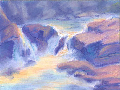
This scan shows progress toward the final image. I started correcting the colors with other sticks. I stopped finger blending on this stage. Where I had colors that were too light, I darkened them and changed them. Some magenta over the peach brought it closer to "red rock in sun" and then I cooled it more with a violet stick. I went back over it with the peach again, blending it back and forth. This gives a different texture than the finger-blended areas.

Stick blending gives a fresher, more sparkling look. Colors that are pure tones are more intense in unblended areas. Often colors right next to each other on the color wheel don't diminish intensity - if you use yellow over red, you get a slightly brighter red. Use complements and you will start to gray the hues.

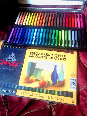
I brought some pink and orange tones into the sunlit water areas. They came out a bit strong even after I went over them with the white stick to lighten them to the pale tints that I wanted. This is where I've got to say it - a big set is better than a small set! I would have had lighter pinks and a good ivory if I still had the 48 color set of Color Conte and definitely would have had many more good tints if I'd crossed the room and got out the big box of 120 Gallery Mungyo Artist Semi-Hard Sticks.

The challenge with a small set is to get tints by putting white down first (so the colors don't stain the white paper), then go very lightly over that with the colors that you're trying to fade to tints, then go over them with the white again. Sandwich the colors between layers of white. I used the color first without that layer of white for them to slide on and so the tinted foam areas were a bit too bold especially at this stage.

I built up that blue highlight on the totally wet rock in the middle of the waterfall with the lighter colors I used for the dry rock highlights, so it came out as a deeper, cooler version of the same color of rock. Just darker because it's wet. I built up the lighter highlight on the rocks at the left too. I played with the shapes some more adjusting them.

By this point I was paying more attention to the painting than to the photo reference. Once you have your forms down, photo references are mostly good for details. When it's rocks, you do not have to get the likeness of that specific rock. Just make it look like a rock. You can pull a pebble from a bag of gravel and draw from life just as easily.

One thing I liked from the photo reference was how many of the original rocks broke in a blocky way. They formed natural crooked stairs with defined, cube-like planes of highlight, lighter shadow and deepest shadow. This type of rock gets good depth into the painting. So I built up my rocks keeping that in mind and didn't wear them down to more rounded shapes like a stack of dinner rolls.

As you sketch rock shapes from imagination, pay attention to the angle of the light. You can mark it with an arrow outside your sketch at the beginning so that you don't forget. Make sure the highlights are all facing the light, brightest highlights are at a 90 degree angle to it. Deepest shadows are at 180 degree angle to that sun angle - like the undersides of the crevices in the rocks.


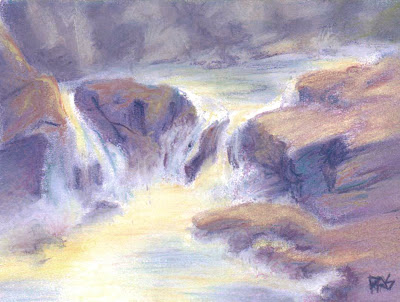
Final stage. I worked over those gold and rose tints in the sunlit water with white until I had them as pale as I could get, the scan still shows them a bit darker than they are in the real painting. I lifted some color on them with the kneaded eraser to achieve that pale gold and pink foam with white highlights limited to the brightest areas of contrast as the water slides over the rock. I also muted many of the colors and toned down some of the other contrasts.

I kept the background cliff cooler and a step lighter than the foreground rocks, because it's misty back there. That gives the painting some depth. I heightened contrast right at the center where the water's sliding around the big boulder and the small one. I played with the shapes one last time and decided that was a good finish. I refined the last details in the focal area and slightly smudged around the edges to keep attention in the middle of the picture.

Now that you've seen my stages, you have my permission to either copy my waterfall painting stage for stage or pick out a photo reference of your own. Anything with rocks and falling water will probably work. Don't worry so much about getting it exact as getting the rock shapes three dimensional and the water flowing.

Have fun! The more colors you have in hard pastels, the merrier, but by finger smudging you can make a small set do the work of a much bigger one.